Scene Analysis: Cinematography in GAME OF THRONES Season 8 Episode 5, "The Bells"
The cinematography in prestige TV shows has a long history of attracting superlatives like “visually stunning”, and to be frank, a lot of the time that claim is bunk. Still, it’s not healthy to dismiss praise like that out of hand every time without deeper thought, so sometimes I’ll test those claims by choosing a simple scene from a show that represents something like a dramatic median, watching it, and deconstructing it. Besides this being a healthy exercise for anyone who loves the cinema, it can yield surprising results that overturn first impressions. Today I thought I’d share that process and apply it to a scene from “The Bells”, the latest (and penultimate) episode of Game of Thrones, a series that has garnered praise from mainstream critics for its craft, even as those same critics have roundly turned against the writing in the last few episodes.
By Willa Ross
The cinematography in prestige TV shows has a long history of attracting superlatives like “visually stunning”, and to be frank, a lot of the time that claim is bunk. Still, it’s not healthy to dismiss praise like that out of hand every time without deeper thought, so sometimes I’ll test those claims by choosing a simple scene from a show that represents something like a dramatic median, watching it, and deconstructing it. Besides this being a healthy exercise for anyone who loves the cinema, it can yield surprising results that overturn first impressions. Today I thought I’d share that process and apply it to a scene from “The Bells”, the latest (and penultimate) episode of Game of Thrones, a series that has garnered praise from mainstream critics for its craft, even as those same critics have roundly turned against the writing in the last few episodes.
A big caveat: I haven't seen the series outside a few scattered episodes (not feeling "invested" is part of the point of the exercise). The big downside, obviously, is that I'm missing a lot of context. As a result, I try to avoid broad dramatic judgments, and to just see how the visuals are functioning in and of themselves. How do they build a sense of the dramatic environment and emotional rhythms of the scene? And, of course, how good do they look?
I often like to use small-scale interiors for this, as they afford filmmakers the most control over all factors while also cutting down on variables. It’s a good-faith methodology that particularly pays off for this episode of GoT, since that city-burning sequence looks ugly as hell.
Before we start, here’s a barebones scene description that purposefully ignores character names and narrative context:
A man writes on paper. A young girl tells him a certain woman won't eat, and that the woman's soldiers are watching her. He takes her hand, reassures her that great risks provide great rewards, and tells her to go.
Here we go!
Shot 1
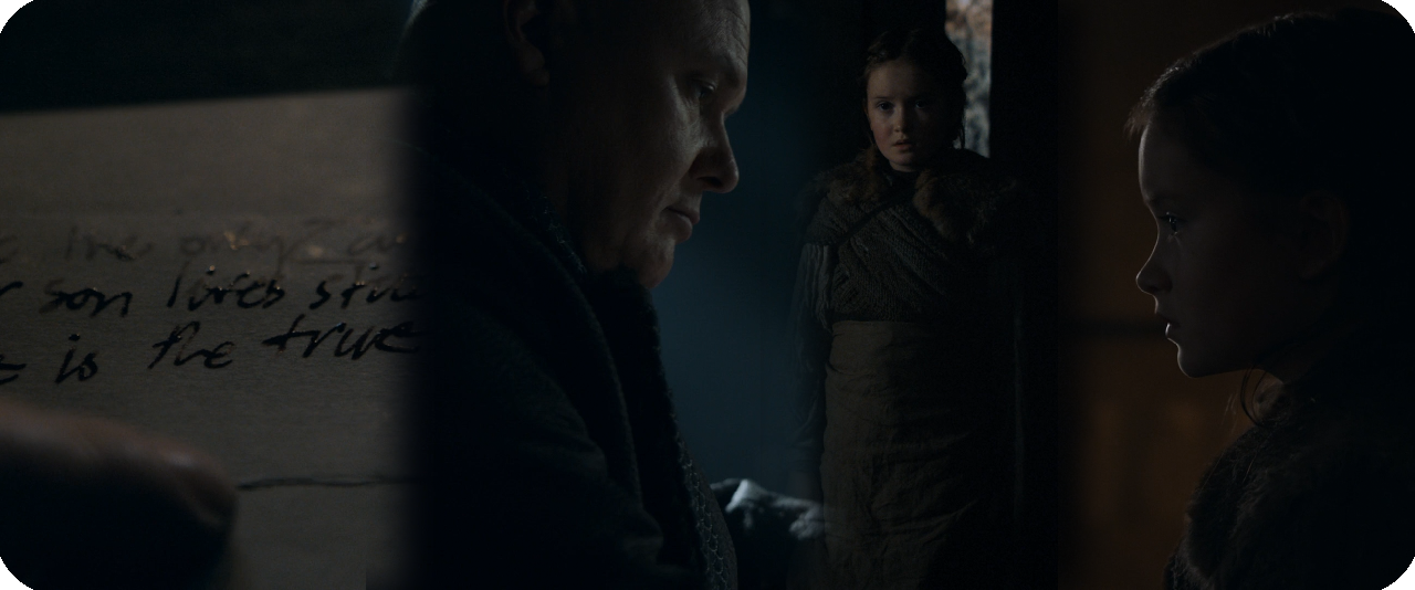
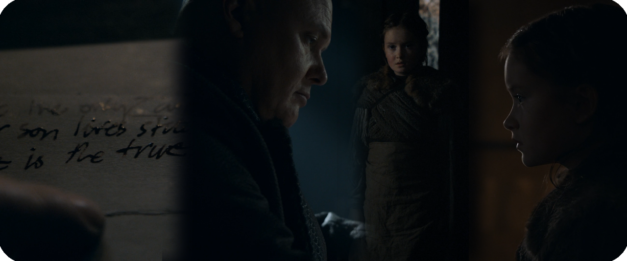
I enjoy it when scenes start with macro shots (extreme closeups of non-humans) that provide some flavour or information that then ripple across the rest of the scene. This is a good example: emphasizing "he is the true heir to the iron throne" here has obvious dramatic potential that gives a charge to what is otherwise a fairly dramatically inert scene. I also like the angle here, both providing a legible view and emphasizing the paper as a tactile object, part of a space. The lighting further helps to characterize the space (though in context the yellowish tinge of light makes little sense since it’s supposed to be daylight, which is strictly represented in blueish tones).
Shot 2
Next, a backwards dolly moves from a closeup of the writer to a wide, and a dark figure steps into foreground. As a camera movement, I think this is well-motivated: it identifies the writer in a view similar to the macro shot of the paper, and then pulls back from that close-up aesthetic to the full scope of the scene. After the initial reveal of the space, the continued motion is justified by a knock on the door, which creates a further sense of potential (perhaps a threat?), so the backwards motion (and indistinctness of the body in foreground) enlivens our curiosity about who's there. The framing of the shot is fairly middling, though that's not necessarily a problem given the lighting scheme (more on that in a moment). Still, it's a fairly unimaginative use of all the negative space offered by the shadows.
One point about the framing worth praise: At the start of the shot, the writer's face is large enough in the frame that he's a clearly discernible figure, in spite of the very dark space. Pulling back makes him smaller, so the camera frames his head into a distinct silhouette over the window. Nice.
Next, let’s address the lighting. GoT has a general attitude of treating medieval-style spaces built of rock and lit entirely by small windows as, y'know, pretty fucking dark. I really respect this more-or-less series-wide choice. It's taken to quite an extreme here, and I like that; there's so much in darkness in this scene that it really bolsters the sense that this guy is tucked into a secret little nook, writing and hearing about things he probably shouldn't. So props for the overall conceit.
However, there are some points of inconsistency that make the lighting feel unnatural across the scene. It’s worth remarking upon, so it’s worth quickly skipping ahead to get a sense of the overall lighting scheme. shot 8 (seen here) reveals that the whole scene is lit by 3 windows and a candle. Two of the windows are on one side of the room, spaced quite far apart, and one is right next to the desk. Hard rays of light are shooting directly through the one near the desk but not the others; the implication is that light streaming through the desk window are direct sunlight. As a result, the direct light hitting the desk has more intense highlights and shadows than the ambient light coming from the right, which just softly lights the side of the writer's face. So far, works fine. Let's move on.
Shot 3
Now we get the payoff to all that buildup of expectations via the knocking and the sweeping backwards dolly: it's just a kid! I like this reversal of expectations and how the visuals of the first shot set it up, but let's talk about this shot. There are only three points of interest in the frame: the girl, that little rectangle of light behind her implying a slightly open door, and those tiny little blue highlights — looks like it's a vase reflecting a bit of the room's sunlight. Otherwise, it’s copious negative space. Now, if we know the whole scene, we can infer that she's being lit by the farther of the two windows on the right, but remember that hasn't been established yet. That feeling of "where's the light source", the overwhelming blackness, the flat angle, and the fact that her body was too close to the camera in the last shot to judge relative distance all contribute to a pronounced spatial confusion. The shot feels totally disconnected from the space of shot 2. It feels abstracted, and not in a deliberate way, but in a way that directly clashes from that big dolly shot's careful delineation of the visible room. That sense of intrinsically understanding the space has been instantly broken by this reverse shot.
But there’s more cause to pile on shot 3. I am not a fan of its composition at all. It does nothing with the negative space, and the girl is too subtly lit for her to stand out as some bright counterpoint. Her and that rectangle are basically just a smudgy vertical stripe. Yuck.
Shot 4
Now we come to a reverse of the writer. This is just an angle from partway through the earlier dolly move, and the composition is again just okay, though I'll spare a positive note for the use of those rays to intensify both his rightward-look at the girl and his interest in his papers. He cuts something of an imposing, intimidating figure in this shot that plays well into the girl’s nervousness and really boosts the dynamic of the scene.
Shot 5
The next shot changes up the shot-reverse formula by placing both characters in the frame. Truthfully, I cannot understand why this wasn't used to introduce the girl. Her small size in the frame relative to him would have emphasized the punchline of her being a lesser threat than we feared, and her position in the space is much, much clearer. If you absolutely had to retain both shots, I would place Shot 3 here instead, as the closer view of her face emphasizes her nervousness about the soldiers watching her, which is the main dramatic beat of this shot. The writer's replies could be played in standard reverse setups. It would work better, I think.
But that’s enough about how I think the scene could or should be, back to how it is. This shot's composition is again just okay. I do like the reverse-L shape creating a frame-within-a-frame, but again wish there was a little more done with the negative space in that within-frame. (A splash of light from a candle would have done wonders here.) Dramatically, it actually does an alright job of expressing the writer's disinterest in the girl's fears: he is either looking down at the paper, or, when he looks at her, his expression is hidden to us, lending an impersonal effect. Still there are ways to do this while also allowing the visuals to better express her fear.
Here's where my misgivings about the lighting come into focus: the light hitting the desk and writer does not look like natural sunlight in this shot. The highlights and hard shadow lines are gone. This was probably done to accommodate the shot, as having blinding highlights and crisply drawn shadows in the foreground would draw attention away from the girl, but this is a case where the shot should have either been rethought or scrapped entirely, because now the light feels completely artificial. Rather than direct sunlight, it looks like either light from a cloudy day, or ambient, indirect light like what the other windows do in other shots. It's soft, it rolls off gradually, it doesn't create bright highlights. It messes with our internal sense of how light works badly.
This shot (and the scene in general so far) really feels like a hodgepodge, like some creative decisions were made, and then a bunch of "practical" choices went on top and at some point the intent and style was left behind. Not without its merits, but not good either. It's these sorts of heavy compromises towards traditions of quality that keeps Game of Thrones's lighting aesthetic from feeling interesting or real. It's why every time I look at an interior scene from the show, I come away thinking "That feels like a studio."
Shot 6
Then we get this! After a series of mostly compositionally uninteresting shots with decreasing dramatic propulsion, we get a very nice reversal from the writer's insouciant demeanour for this simply expressed gesture of kindness. I wouldn't call it a masterpiece, but I don't have anything bad to say about this shot: they committed to the lighting in smart ways, created a nice lighting gradient on the desk that silhouettes the hand well, and I like the subtle rim light over the top of the hand. It also contrasts to the prior shots, all fairly traditionally placed mediums and wides, and returns us to Shot 1's display of the dramatic potential of a hand. It doesn't redeem the scene (the whole has already stacked too many problems), but I like it a lot.
Shot 7
Next, we get the first properly expressive shot of the girl. Conceptually, it works as a great counterpoint: mirroring the hand, emphasizing both the distance between them and the potential for a human connection. Eye lights, subtle soft shadow lighting, and a very nice profile rim create a really nice, dimly lit portrait of her face, and the orange, flickering candlelight in the background complements the blue tones prevalent elsewhere in the scene and helps her face stand out instead of negative space.
WHERE WAS THIS CANDLELIGHT IN THE EARLIER SHOTS OF HER? On a purely logical level you could argue that it's close to the wall and therefore would only light the wall, but this could and should have been "cheated" to light the wall closer to her without anyone questioning it. That, or just add another candle! It's possible (even probable) that this was the sort of technical oversight common to the fast pace and budget limitations of television, but hey — that just speaks to not working well with your medium's limitations.
But I don't want to end my notes on this shot on a negative. It doesn't have the same punch and "wow" factor as shot 6, but it builds off it smartly, and I like it just as much.
Shot 8
Shot 8 is the widest shot of the scene and reveals all of the light sources. This is probably the compositionally strongest non-closeup in the scene, with the light rays explicitly casting the writer as a saint-like figure, and the dark space between him and the girl well used, since she crosses it over the course of the shot — "Crossing the darkness to forge a human connection," something like that. Unfortunately, it also reverses some of the scene's more interesting visual choices.
First, there is virtually no *true* negative space in the room, since very little of it is black, except for the shadow under the desk. Almost everything else has gradations of light and perceptible detail or geometric activity going on. The justification may be "It would look weird to have a wide where we can't see any of the room", but I say, that's what would make it interesting. Run with it! Have the characters in a pool of light in the middle of a sea of blackness! This speaks to those traditions of quality (i.e. "Production Value") in TV that Game of Thrones adheres to in its lighting and, again, makes its spaces feel a lot less visually interesting and convincing than they should. It's both inconsistent and a missed creative opportunity.
Second, it suddenly reveals the room to be much larger than it seemed before. Earlier, there was no hint that the space was this big; it would be natural to infer the wall would be halfway between this camera position and the characters. You can kind of justify this by saying: the connection they form opens up emotional space, that making the room "bigger" connotes hope, etc. I think communicating these ideas between two individuals in a secretive room is much more interesting... and more consistent.
Don’t get me wrong, in a vacuum, it’s a fine shot, though unimpressive in its use of light. It’s the inconsistencies and lack of stylistic commitment that make it a bit of a liability to the scene overall.
Shot 9
A closeup of the girl. Her relative size, the angle, and the fact that the camera is panning as she walks into her place makes me believe this is the same shot setup as Shot 7, and the candlelight was *just* out of frame before the pan. Real shame. I can’t think of a good reason not to have a second candle in the room to fix this.
It's not a particularly interesting shot, but it works fine, meat-and-potatoes shot-reverse stuff here. Kind of an uninteresting way to end an interaction that had such visual fireworks a few seconds ago, though.
Shot 10
Again, probably just a slightly adjusted position from the dolly track. Not much new to say, except that having each character visible in the foreground of the other's reverse shot is kind of a nice way to suggest their newfound emotional proximity. It still feels anti-climactic.
Shot 11
Now we move into the final two shots of the scene, which form a visual denouement. In shot 10 we pan back out of the candlelight as the girl walks away. It's not an interesting shot, but here her moving into blackness at least *kinda* makes sense as she moves out of that emotional warmth, and the panning movement makes it feel much more dynamic than shot 3.
Shot 12
Finally, the dolly moves in closer to the writer, mirroring the girl moving away from the camera in shot 11. Dollying in on a thinking character is kind of a one-size-fits-all way to put a button on your scene, and it comes off as especially uninteresting when the character’s face is so still and inscrutable, but nonetheless it works just fine; I have neither a positive nor negative reaction to it.
Summing Up
While the scene has some points of aesthetic interest and a genuinely impressive moment spanning two very well-thought-out shots, its ideas otherwise never connect into a cohesive whole, either on the level of individual shots or the entire scene. While the limitations of TV often dictate limited setups and camera placements that are then reused across the scene, this means that A: If you want a visually sumptuous TV show, you have to work well with those limitations and find ways to make them sing (see: Rainer Werner Fassbinder’s Berlin Alexanderplatz), or B: You de-emphasize or scale back on the number of aesthetic elements you're playing with and maximize your use of a more limited technical palette. The vast majority of the time, TV is better served by B.
In short, the scene is visually not really remarkable, and yet it's still one of the highlights of the episode's cinematography. Time and time again, even in the most favourable sequences, I can never find means to justify the widespread hyperbole about the cinematography in Game of Thrones.
Notes on John Wick (2014)
I can no longer ignore these. Wick, like a lot of action movies that boast technically astonishing fight choreography, is directed by two veterans of stuntwork, Chad Stahelski and David Leitch; the question with auteurs who come into the genre from this direction is whether they are only interested in feature length technical expressions of the craft they practiced outside the director's chair, or whether they're interested in dramatic modulation emotionally resonant aesthetic choices, technique that expresses more than technical strength.
By Willa Ross
For years, I've avoided this, its first sequel, and Atomic Blonde, in large part because the kind of acclaim they received tended to overlap heavily with The Raid 2: Berendal, a film I do not care for. The Raid 2, for my money, is a film interested in intricately choreographed action without character (let alone characters), which frequently takes as its emphasis the physical brutalization and mutilation of the body, with an expectation that this will be played sheerly for laughs. It's a film that crosses the line between a cathartic, escapist enjoyment of carefully staged violence anchored in an emotional context, and a giddy display of pain and technical virtuosity without attempting a structure or sense of progression in each action scene. Descriptions of the John Wicks tended to both explicitly cite The Raid 2 as similar, and describe John Wick in nearly identical terms.
Regardless, like the Raid movies, John Wick and its Chapter 2 sequel have been common in discussions of contemporary action cinema and its exemplars, and as someone who cares very much about the genre and would like to see its potential ways forward outside the Marvel Cinematic Universe, I can no longer ignore these. Wick, like a lot of action movies that boast technically astonishing fight choreography, is directed by two veterans of stuntwork, Chad Stahelski and David Leitch; the question with auteurs who come into the genre from this direction is whether they are only interested in feature length technical expressions of the craft they practiced outside the director's chair, or whether they're interested in dramatic modulation emotionally resonant aesthetic choices, technique that expresses more than technical strength.
The answer is that they do care — in fact, sometimes they seems to care more than their writer Derek Kolstad — though as of this first entry they’re inexperienced hands at showing it. John Wick's action deserves the praise it gets as a technical showcase for Stahelski and Leitch, their stunt team, and Keanu Reeves; it is also, thankfully, an action movie with an interest in how its characters think — not to mention it knows how to tell a fucking joke. The brutality on display here is undeniable, but the film takes its time over around 30 minutes to establish it as an almost abstract metaphor for the title character's rage: rage that, with all the senseless loss and grief that one can endure by chance in life, human beings can also enact cruelty by choice. In John Wick, the thematic locus of that cruelty remains frustratingly abstract; crime-revenge cliche explanations for the senseless pain that Wick endures are trotted out — "the past", "bad luck", "people don't change" — but don't actually find much in the narrative to support them, and tend to come off as a self-serious hodgepodge attempt to simulate emotional grandeur without doing the work for it. Nonetheless, they kill the guy's adorable fucking puppy. There's a dramatic core there to work with. I mean, I don't know about you, but I love puppies.
If Wick embraced that kinda goofy degree of emotional simplicity more, it'd probably do it a lot more good than the way it strains to show import. While I genuinely appreciate the time the film takes to establish Wick as a man suffering terrible grief in the opening sequences, both the writing and direction of these scenes are full of cliches and feel more perfunctory than they clearly intend to, with hardly any inspired moments that establish a genuine connection. (An exception: the puppy wakes up Wick just seconds before his alarm clock buzzes. Awww. I love puppies.)
Regardless, the shot direction, sound, and music of the pre-puppy-killing scenes are thoroughly unimpressive: boilerplate drama without much more to than kinda hackneyed screenplay gestures and a blue filter to lend it emotional heft. One could levy complaints at Reeves’s customarily subdued performance for not expressing more, but it’s entirely in keeping with his character. Most frustrating in these scenes is the wandering, isolated piano chords, so familiar to this kind of material that it actively saps personality out of the film when it plays (the score turns out to be by far the film’s biggest liability). One moment in particular does far more to legitimize the sorrow being pushed forward by these scenes than any other: Willem Dafoe, whose sunken features can without effort express as much long-suffered pain as any actor trying their absolute hardest, offers Wick’s single best line delivery when he tells John, with a mixture of boredom, pity, and personal melancholy, “There’s no rhyme or reason to this life. It’s days like today scattered among the rest.” Dafoe does solid work throughout, but this is plainly the moment he was cast for, and it’s the highlight of the film’s vulnerable side.
Eventually, though, the bad mobsters kill the puppy and beat up John and steal his car, and the fighting begins. I won’t go so far as to say that the plot is unimportant going forward — it’s pretty stock, but it’s a plot, and it is used to propel the action material and maintain a sense of stakes — but there’s not much reason to detail it or its effects any further than I did between those em dashes just now. This isn’t entirely a complaint, as just because something is “simple” doesn’t mean it can’t be interesting or serve the work as a whole. Still, there’s a thin line between simplicity and dullness that the film’s plotty sections sometimes fall on the wrong side of; specifically, I wish there was more playfulness in how these mobster characters are written (beyond a funny running gag that, contra standard depictions of overconfident, egomaniacal organized criminals, everyone seems kind of resigned to the fact that Wick is bound to slaughter them effortlessly).
One of the film’s chief pleasures is that slaughtering dozens of people does look hard. Partly thanks to the fact that Reeves accomplishes the vast majority of his own stunts, a sense of constant, extreme bodily exertion comes through in every gunfight. It’s not just good because it looks hard, either; I would argue that the greatest (and most commonly neglected) asset of watching an action scene is showing how combatants adopt tactics and then shift them over the course of battle, and while John Wick does occasionally fall into rote cover-and-suppress-and-shoot staging with little to distinguish the behaviour at the end of the fight from the start, it otherwise succeeds through a pliable formula: John Wick and a few dozen baddies are in a room; the baddies set the pace and direction of battle; John adapts. How John adapts presents dozens of little surprises, as if every few seconds he solves a complex puzzle using only his body and his gun.
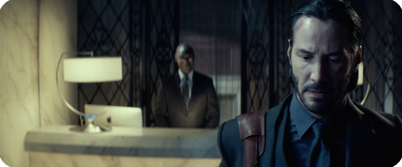
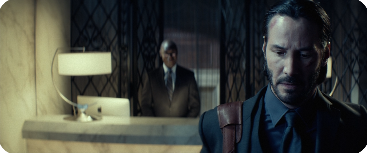
The action moves so fast that we really do need to give Stahelski and Leitch props for just how well they understands action staging; it’s very rare that the camera’s movement and the cutting create spatial confusion, the most important objects and events are most always emphasized by the framing, and the graphic orientations and motions within the frame create clean, easily followed cuts. The only serious liability on following the action is the film’s bizarre commitment to low-contrast, low-highlight cinematography, perhaps selected because of its associations with a grittier tone and “artier” visuals; this compressed dynamic range inevitably reduces the audience’s ability to distinguish details which, in fast-paced, complicated action sequences, can make it harder than it should be to figure out who is doing what.
The overall camera positioning conceits are solid enough that I can’t help but lay some blame for this with Jonathan Sela, a cinematographer whose work I’ve yet to find cause to enjoy. Besides the contrast, Sela also has serious issues with composing interesting, well-balanced frames. The scope ratio of 2.35:1 that’s become standard issue in mass-commercialized and genre pictures is almost certainly the hardest standard frame to compose for, so heavily horizontal as it is, and Sela hardly ever martials the geometry of his shots into something memorable or expressive — and when he does, the contrast scuttles it. John Wick also opts for a look that usually favours strong, non-natural colour washes, and that can be an interesting approach with a lot of creative potential. Limiting the colour range gives the eye less means to delineate the subjects of an image, which can be compensated for by — you guessed it — a higher contrast, or careful framing. It’s all a good example of decisions that can be intellectualized in a vacuum, but wind up doing damage to each other in practice, and aren’t especially well-executed taken on their own anyway.
Unfortunately we can’t leave the film alone with that sweeping dismissal. If you’re one for reading parentheticals (and fuck everyone who’s not, am I right folks?), you probably noticed that I said the score was John Wick’s biggest liability. And it is. The music for this movie is downright awful, and once the movie exits its low gear of ominous, metallic drones and boring piano chords, it moves into the equally thoughtless but far more irritating mode of boring rock pieces, anchored by thuddingly static drum lines and generic guitar chords. Even pre-existing music like Marilyn Manson’s “Killing Strangers” fails to stand out whatsoever from the musical tapestry on display outside of the vocals. For all the failings of the photography, you can at least detect that someone wanted to think of ways to make this look different from other movies. It doesn’t come across like any effort was made to craft a distinct soundtrack here. Frankly, it sounds like something pulled from a sound library and slapped on the soundtrack with only cursory attention to the film’s emotional ebbs and flow.
Underlying all these issues is a sense that, in spite of honest efforts by Stahelski and Leitch to develop their movie’s personality beyond that of a stunt/fight choreography extravaganza, John Wick doesn’t have a clear personality that you could describe without contradicting yourself. Yet I still liked it, not only for the effort on display, but for the numerous moments when it succeeds so well, most often in moments when John dives, rolls, whips around, or tackles his way through foes who almost never seem like they’re designed to be just stupid enough kill. But it also doesn’t look anything like a revelatory piece of contemporary action cinema to me. The landscape before and after this came out in 2014 doesn’t seem that different. It’s hard to say this is more than one more shoot-em-up, scattered among the rest.
Other Essays in This Series
John Wick
John Wick: Chapter 2
John Wick: Chapter 3 – Parabellum
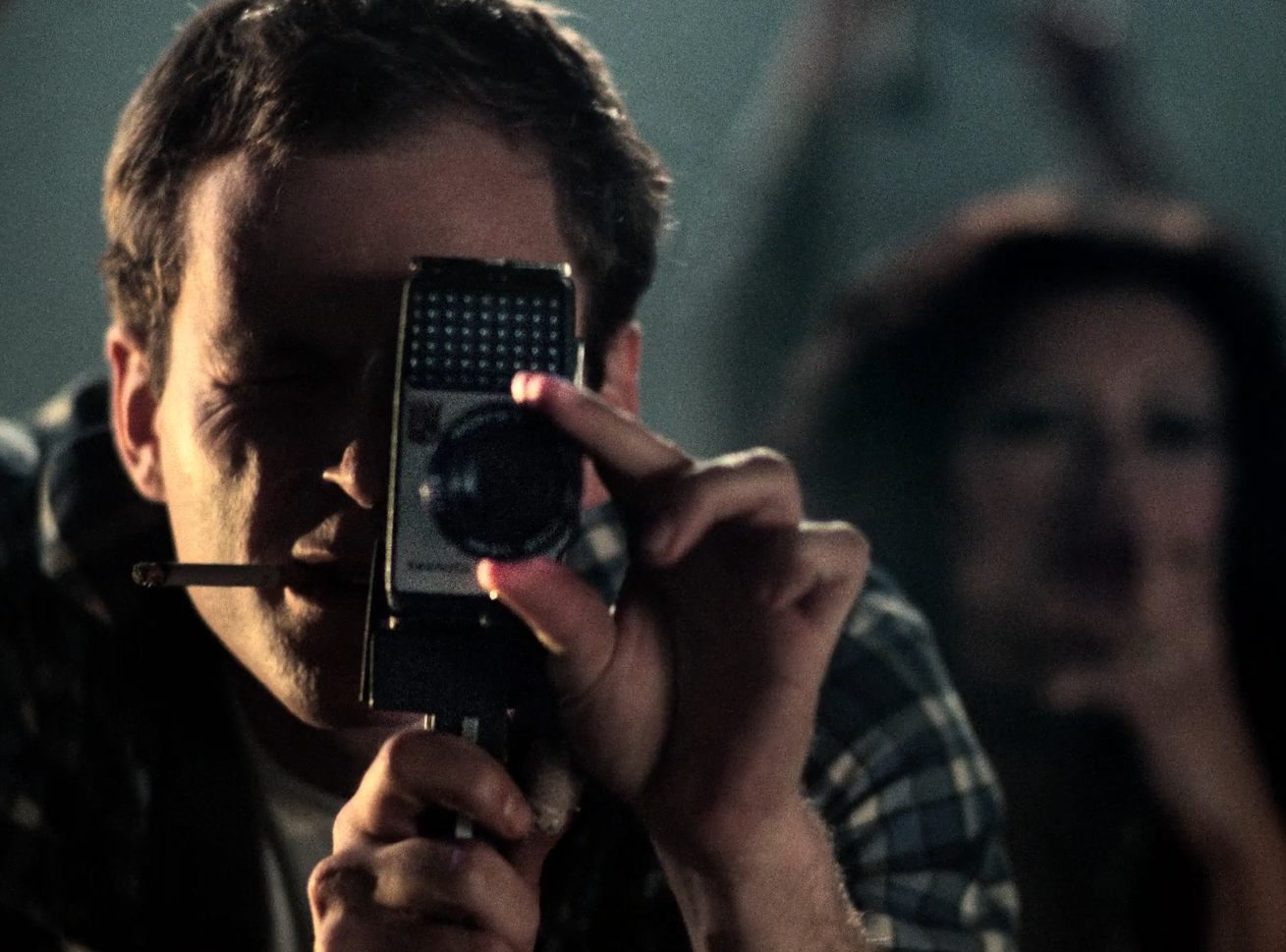
“The Other Side of the Wind”: The Absence of Orson Welles
Several months later, the layers of meta-meaning in Welles’s swan-song continue to play out across a long moebius strip in my mind, and each new circuit around the loop reveals something I’d missed on the last go-round.
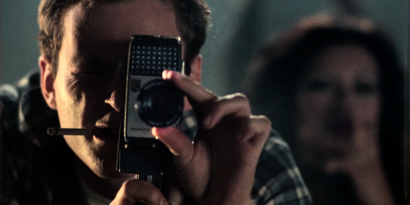
by Willa Ross
Whatever its necessarily finished-unfinished form may mean in terms of the unrealized potential of The Other Side of the Wind, there’s not another 2018 movie I’ve spent so much time thinking about. Several months later, the layers of meta-meaning in Welles’s swan-song continue to play out across a long moebius strip in my mind, and each new circuit around the loop reveals something I’d missed on the last go-round (particularly after reading Josh Karp’s excellent making-of book Orson Welles’s Last Movie).
Those who were disappointed by Wind tend to turn their attention to the fact that Welles never finished it, and therein find evidence for how this created deficiencies in the film. I don’t agree with this perspective. It seems to me that the consensus — even among the film’s defenders — that a Welles-completed cut would have been ideal has shown an unhealthy level of certainty, and there is much to appreciate in its current (final?) form that would not be possible had the film been completed under his scissors and splices before his death in October 1985. The most moving example comes up front: instead of the room-filling thunder of Welles’s low, commanding narration filling the screening room over the opening montage of stills, we hear Peter Bogdanovich, in character as Brooks Otterlake. The text is near-identical to Welles’s, with the exception of a handful of new lines in which Otterlake, the hotshot acolyte of the fading genius of cinema Jake Hannaford, admits that it’s his fault the film you are about to see has taken decades to reach viewers “because, frankly, I didn’t like how I came off. But I’m old enough now not to care how my role in Jake’s life is interpreted.”
Otterlake, of course, is almost-but-not-quite a fictional mirror of Bogdanovich himself, just as Hannaford comes close enough to Welles that we can neither psychoanalyze the real man himself through the character nor dismiss him as being loosely inspired by the real legend’s personal fears and foibles. Bogdanovich’s own career trajectory, a comparable slew of disasters following an early breakout, makes the sound of Otterlake’s tired voice admitting defeat more poignant than Welles’s comparatively detached introduction could ever have been. It completes the cycle of the two men’s relationship; it connects the loop. The question of whether the two sides of that particular moebius strip are Otterlake and Hannaford or Welles and Bogdanovich is one of the film’s great gifts to its viewer, one that a 1985 Wind could not have offered.
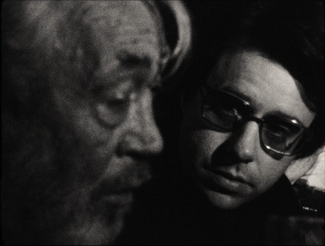
Whatever my objections to the assumption that the best version of Wind would be one done in Welles’s lifetime, it’s certainly natural to consider this late-born bookend as an exercise in coulda-been. That open unfinishedness is a part of the movie’s DNA, a hodgepodge of sporadically-captured vignettes filmed in various formats that could only be assembled towards a clipped, elliptical result. The difference is that now the film is broadly seen as a finished-unfinished film, whereas the original effect would have been an unfinished-finished one. It's ironic that, besides a couple party scenes, almost none of the film-without-a-film — that is, the material about the fallen director Jake Hannaford on the last night of his life — was cut into any sort of "fine" form by Welles. However, excepting the nightclub sequence that sees Hannaford’s leading man silently pursuing his subject of sexual obsession into a bathroom, Welles finished editing all of the film-within-a-film himself. So the unfinished film that Hannaford so desperately seeks to find funding for is basically Welles's finished film, and the rest of the finished film we have now is Welles's unfinished film.
Puzzles and paradoxes like this are what make the metanarrative of Wind so rewarding. It’s no wonder why Netflix released a making-of documentary, They’ll Love Me When I’m Dead, alongside it. To appreciate what’s been accomplished here requires a viewer unafraid to search far outside the diegesis for answers. Wind almost seems to beckon the viewer to become an academically-minded scrutinizer of its own production, hunting through history for clues to the movie’s subtext. On one hand, that sounds like something Welles probably would have hated to do. On the other, the man seemed to enjoy playing tricks on himself as much as his audience.
But The Other Side of the Wind is an allegory for more than itself. The eventual relegation of Hannaford's Hollywood comeback film — an attempt to make something in tune with the current aesthetic trends — to a drive-in screening that nobody ultimately attends is itself a reference to Touch of Evil. Welles hoped that picture would announce his commercial viability in the States, following three prior projects without major studio backing. It was ultimately distributed as a B-movie and mostly seen, when it was seen, in drive-ins, and in a shape not at all commensurate with its director's final intentions. Thus we can read the film-within-a-film and its rejection by studio executives as not only a parody of Antonioni and a funhouse reflection of Welles's Wind itself, but also a bitter reflection on the last time Welles attempted to synchronize his artistic instincts with commercial practicality.
Welles insisted that none of this was autobiography. Yet these historical rhymes, along with countless other details of character, incident, and backstory, clearly confirm to all but the most credulous adherents of his denials that, more than anything, the man wrote and photographed a film that was (at least circuitously) about himself. Yet the famously imposing figure of Welles never appears. Instead of his intended role as the prologue’s narrator, he can only be heard in a few offhand lines as a journalist, a performance he almost certainly meant for somebody else to dub over later.
There’s more where that came from, more parallels between the actors and the characters they play, and the characters and other real people, and events and themes and truth and fiction. The film's extremely protracted production history may remove Welles's personal direction and inspiration from the Wind that’s finally available to us, but they also ennoble and enrich it as a work of aging and repetition and replication and generational inheritance and film history itself. This story at once takes place over the course of 12 or so hours and 48 years — the latter quality affirmed by the newly written allusion to cell phones in the prologue.

Jakes's bon mot of "it's alright to borrow from each other, what me must never do is borrow from ourselves" is, on the surface, an empty plaudit, designed to amuse an uncritical crowd. Still, it strikes at the psychological core of Wind's characters, who literally and figuratively project themselves onto and imitate and perform as other people, but refuse to display their inner selves. The collage-documentary aesthetic Welles chose works in counterpoint to this central theme: no matter how many angles, formats, stylistic departures, and movements you use to reveal the subject, the images will always be defined by what you don't see. This reminded me of Errol Morris’s Standard Operating Procedure, an actual documentary that insists on looking to the margins of documentation to find truth. Like so many Morris movies, SOP seems ahead of the curve for its time and place and has yet to see its more radical ideas picked up by others. The Other Side of the Wind, for its part, wrapped filming in 1976, was directed by the man who made Citizen Kane, and still saw no shortage of critical reactions that shrugged it off as being fairly unsubstantial. More than 30 years after his death and the canonization of several more of his movies, Orson Welles’s track record still can’t convince everyone to give the new stuff he tries a second thought.
Still, as painful as it is to convert that “tries” into “tried”, this pretty much wraps it up as far as new things for Welles to surprise us with (barring the discovery of his cut of The Magnificent Ambersons (or some kind of attempt to construct the Don Quixote footage into something Welles might have wanted. Who knows)). Thankfully, we’ve been left a more than worthy stylistic summation of Welles's career, and the techniques particular to him — deep-focus cinematography, lengthy, exploratory tracking shots, wide angle lenses, and, finally, near-cubist cutting patterns — are here used to photograph subjects who can never be truly known by anyone, even themselves, let alone a camera and editing bay. Like Rosebud, the tantalizingly incomplete and incoherent film-within-a-film-of-the-same-name promises a potential revelation of Hannaford's psyche that we can never truly access; likewise for Welles himself and his Wind, an approximated last testament for a man who, to the last, would disclaim that he was Jake Hannaford.
There is no Orson Welles to see here, said Orson Welles, a protestation he couldn’t have expected us to accept at face value. In the moment when the movie seems to suggest we can best "see" Jake Hannaford for who he really is — the devastating psychoanalysis by his nemesis film critic that he seems to affirm with his violent response — there is nothing to see of Jake but a disjunctive closeup that does little to place him in the space. At the moment of the slap and its aftermath, he's lost somewhere in a black void or beyond the frame, and he doesn't reappear until his final meeting with Dale back at the ranch. Maybe even more telling in this respect is the film's first visual, a photograph of the wrecked sports car that Hannaford used to end it all — a photograph in which he is nowhere to be seen. At his most exposed, Jake disappears from the picture. He vanishes into the same off-screen ether as his real-life author: the late, great Orson Welles, the most famous actor-director in the cinema's history, here remixing the meanings of that multi-hyphenation in a more original and difficult sense than anyone but him could have imagined.
![The.Other.Side.of.the.Wind.2018.REPACK.1080p.NF.WEB-DL.DD5.1.x264-NTG.mkv_snapshot_00.01.07_[2019.03.06_01.02.17].png](https://images.squarespace-cdn.com/content/v1/578e7a0c197aea26a696f7f1/1551863475358-Z9FKC8J4QG939MQU2FO9/The.Other.Side.of.the.Wind.2018.REPACK.1080p.NF.WEB-DL.DD5.1.x264-NTG.mkv_snapshot_00.01.07_%5B2019.03.06_01.02.17%5D.png)
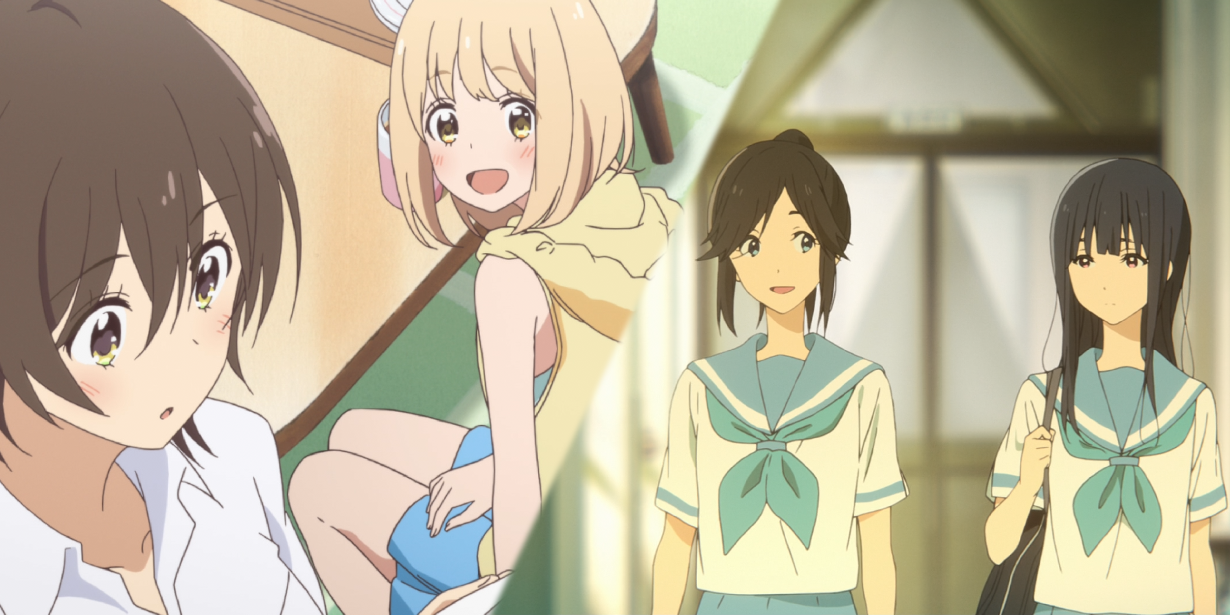
Blue Mornings, Hidden Gazes: on queerness in "Liz and the Blue Bird" and "Kase-san and the Morning Glories"
Two anime films that are kindred in their approaches to high school girls discovering their queerness, despite the chasmic differences of style and tone between them.
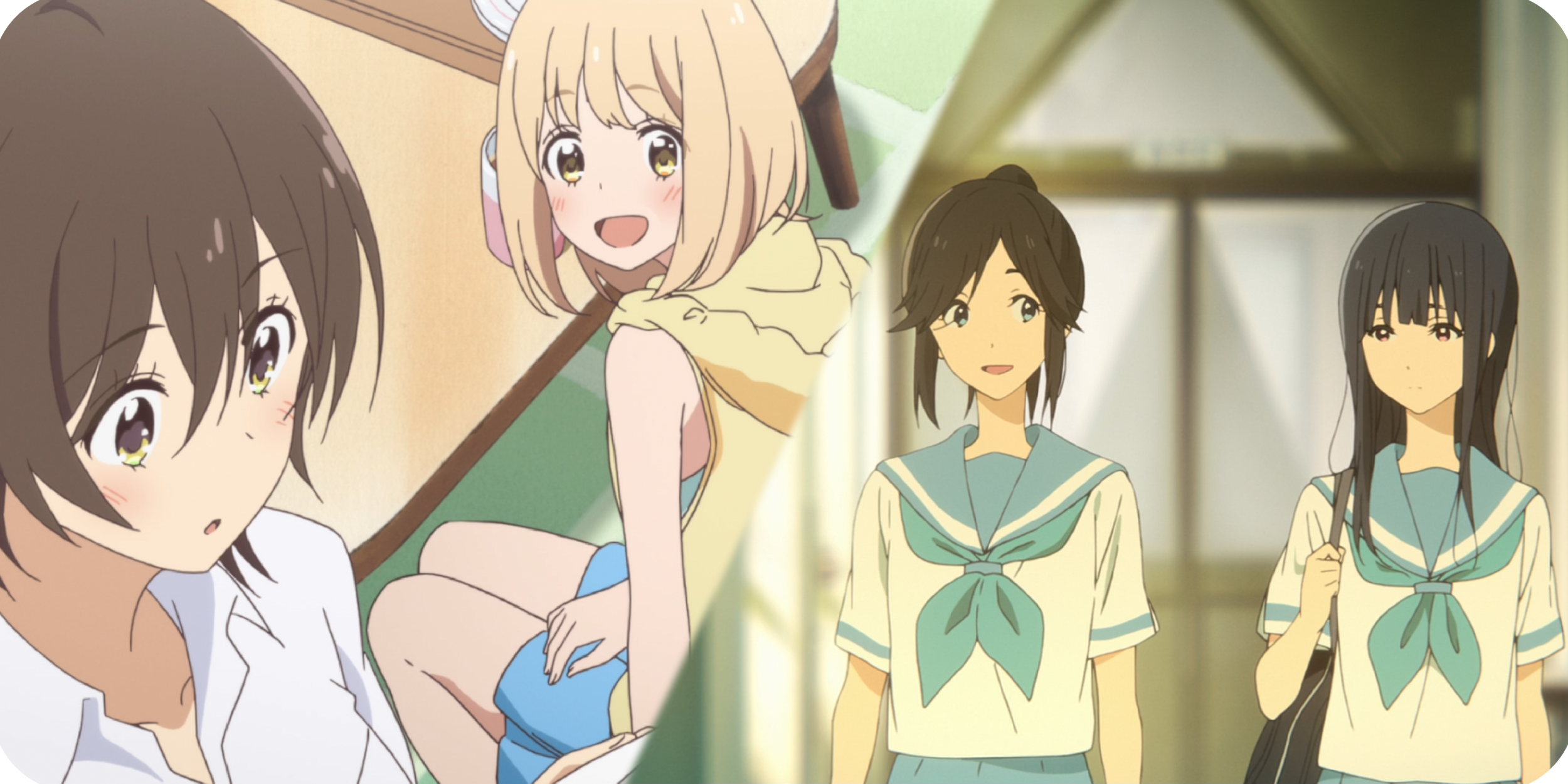
by Willa Ross
I don't know about you, but for me many of the happiest moments of consuming art are coincidences: moments when a work finds synchronicity with my personal life; when an audience taps into a special, collective energy of appreciation that cannot be replicated before or after; when a double feature unwittingly presents itself. The latest such coincidence for me was seeing Kase-san and the Morning Glories and Liz and the Blue Bird within a few days of each other. Both films are yuri — anime centered on female characters in homosexual relationships — and seemed to me kindred in their approaches to high school girls discovering their queerness, despite the chasmic differences of style and tone between them.
I. Morning Glories
Kase-san and the Morning Glories, a brief feature (under one hour) that adapts select episodes from a long-running manga series, is immediately striking for what it omits. As it begins, the leads Kase and Yamada have already entered into a relationship. The removal of any courtship process quickly precludes the trope within queer coming-of-age narratives of the characters discovering their sexuality — instead, the tension of the early relationship centers on the girls’ self-esteem and perceptions of each other. Like many teenagers in love, they're deeply aware of the other's positive qualities, and view the absence of those qualities within themselves as personal failings whose discovery by their partner is bound to disappoint. For her part, Yamada is a fastidious, withdrawn gardening type with proclivities towards overtly girly dress and home decoration, while Kase is a popular track star whose short hair, height, athleticism, and comparative brashness lend a somewhat more masculine temperament. Yamada’s embarrassment is poorly hidden, shown both through wild caricature and the oh-so-anime sprouting of weeds from her head in moments of particular humiliation — and this more open emotional state makes her the natural choice as narrator and effective protagonist. Kase, on the other hand, is far more reserved with her inner life, given to expressing it quietly in moments of pained confession, or with sudden, assertive outbursts. Unlike Yamada, we may frequently wonder how Yamada feels about a given subject, or if she has any feelings on the matter at all.

All of this may give the impression that Kase-san and the Morning Glories approaches romance between girls by coding them with standard straight, cisgender traits, crafting a romantic narrative with mass appeal by making it closely proximate to the cliches of mainstream love stories. This reading seems to gain legitimacy when considered with the lack of any overt references within the film towards their coupling as being socially unusual, let alone the subject of prejudice within Japan. In other words, these qualities, taken on their own, send up classic red flags of representation: make the depiction of marginalized people more palatable by omitting social and systemic biases from the equation. Yet this is where the film's tactics of representation start, not where they end, and Morning Glories evokes a muted sense of social repression with isolated moments in the drama that allow underlying anxieties to peek through for split seconds. This elliptical approach is announced in almost literal terms in the film’s first words, a single line of prologue narration by Yamada, “We’re both girls, but…”. Navigating a romance as girls is thus evoked as something deeply felt, but never spoken. In other words, the social discouragement of queer relationships manifests not through chiding, or through measurable social exclusion, but through the seeming impossibility of its utterance, let alone confrontation.
While this often serves to complicate moments of standard teenage romance (like, for instance, the nervousness of a first kiss, or the fear of revealing a relationship to peers) with an ambiguous social element, at times it comes close to announcing itself more overtly. In one scene Yamada invites Kase into her house for the first time while her parents happen to be absent. The sexual implications of being alone in a bedroom in an empty house are lost on Yamada (who has a much more abstract sense of fear over their blossoming intimacy), but not on Kase, and after some comic misunderstanding, Kase announces her intent and willingness by pushing Yamada back onto the bed, looking over her and saying “I want to go out with you properly. I mean it.” The tonal whiplash of the moment focuses our attention and helps to announce that the subtext of social repression is nearly boiling over, and in spite of our fear over the sexually threatening positions of the characters, Kase’s face does not show frustration, anger, or entitlement, but embarrassment and sadness. Moments later, Yamada’s parents come home, interrupting their near-coitus, and Kase laughs it off and suggests “Let’s do it some other time.” While “going out properly” refers most obviously to the social pressure on teenage couples to express the seriousness of their bond through sex, in Kase’s case that’s merely a symptom of a deeper fear: that their relationship won’t advance beyond an intimate platonic friendship, and that they either won’t acknowledge their romantic feelings — and lust — or, worse, they won’t permit themselves to feel them at all. Like everything else in Morning Glories, the sequence concludes happily, with the two cuddling on the bed, acknowledging sexual desire as a component of their attraction but not necessitating the act of sexual contact in order to legitimate it.
![00000.m2ts_snapshot_24.10_[2019.03.04_01.01.16].png](https://images.squarespace-cdn.com/content/v1/578e7a0c197aea26a696f7f1/1551690089668-HOYDUKWLB8HEFFMEUQZX/00000.m2ts_snapshot_24.10_%5B2019.03.04_01.01.16%5D.png)
The scene, like the rest of the movie, is overwhelmingly cute and happy-go-lucky, short on protracted crises and even shorter on conflict. That's exactly what allows its deeper issues — alluded to but never elaborated or explicated — to be cast in tonal relief. Only in the most private space possible, the bedroom, do either of the girls approach an open acknowledgement of their social erasure and marginalization. When in view and earshot of others, they behave as friends, only allowing themselves gestures of intimacy and open discussion of their relationship when there's nobody else around, until in the very last scene their love is publicly expressed, an act shown as necessary for them to fully realize a lasting and meaningful relationship. The subtlety of their oppression ensures that its seeming absence looms over the rest of the work.
II. Blue Birds
I’m not sure I’ve ever seen a movie with as many shots of feet in it as Liz and the Blue Bird. Here, anxiety is acknowledged and near-ubiquitous, and it’s the expression of desire that’s never allowed to surface. Where Morning Glories magnifies fears surrounding marginalization by eliding them in all but a few key moments, Blue Bird magnifies them by eliding almost everything else. Here, it’s the romantic longing that goes unspoken, although its presence is made painfully clear in every scene via the camera and editing’s lyrical gaze and rhythm. Like Morning Glories the subjects are two high school girls, Mizore and Nozomi. Unlike Morning Glories, they are in a decidedly platonic friendship that finds itself on rocky ground as graduation approaches. Mizore is a morose introvert, unwilling to socialize with almost anyone besides Nozomi, a springy social nucleus who’s quick to smile but whose deeper thoughts register as either obscure or mercurial. Years earlier, Nozomi apparently made a concerted effort to involve Mizore in their school’s band club, and has found herself almost attached at the hip ever since. Nozomi, seems content with this, but holds Mizore at an emotional arm’s length, implicitly aware that the latter admires her as more than a friend. Nozomi neither judges Mizore’s sullen reluctance to share her thoughts and feelings nor seeks them out. There is an uneasy, unsustainable equilibrium.

Yet the film itself is happy to share Mizore’s thoughts with us, not so much adopting her perspective as empathetically (and emphatically) perceiving it. The first time we see the two spending time together, a long sequence of closeups makes clear Mizore’s romantic adoration of her friend by establishing a hypnotic cadence to the movements of Nozomi’s body: the waving of her skirt, the swishing of her ponytail, the swing of her arms. These POV shots are mixed with ones that emphasize their location (the clinically desaturated halls of their high school) and their distance from each other, and they collectively eschew traditional approaches to composition and continuity in order to suggest the emotionally disjunctive experience of unrequited love. To both put a button on this sequence as the film’s formal manifesto and make the intent of these techniques perfectly clear, it ends with a cut to a hand-drawn title card of one word: “disjoint”.
It’s a manifesto that the rest of Blue Bird makes good on, as every scene’s shape takes as much interest in quotidian gestures and poses as the interplay and subtext of character dialogue. The effect is unusual enough to be “arthouse”, but it also reminds me of the tactics that thrillers often use to maximize effect and excitement. To sit close to her love, to sense her hair falling towards their shoulder, is a euphoric experience for Mizore, and the film unearths queer affection through these and other details that go unacknowledged by characters, but land as much more than quotidian trivialities.
Art itself is taken as an important tool for understanding the girls’ connection, both for the audience and the girls themselves. A storybook film-within-the-film establishes a story of two characters whose metaphorical application to the main story fluctuates in both the audience and the characters’ minds. The process of preparing a shared musical solo becomes a means to exposit the girls’ unwillingness to fully reveal themselves to each other, until in an extraordinary musical sequence, they do. (That scene is the first of the film’s devastating double climax, preceding a scene in a lab classroom whose dialogue finds the girls stumbling towards and around their fears and desires in a masterfully written scene of awkward intimation and mutual terror.) Taken collectively these are unmistakable signals that must be actively ignored to deny their romantic implications.
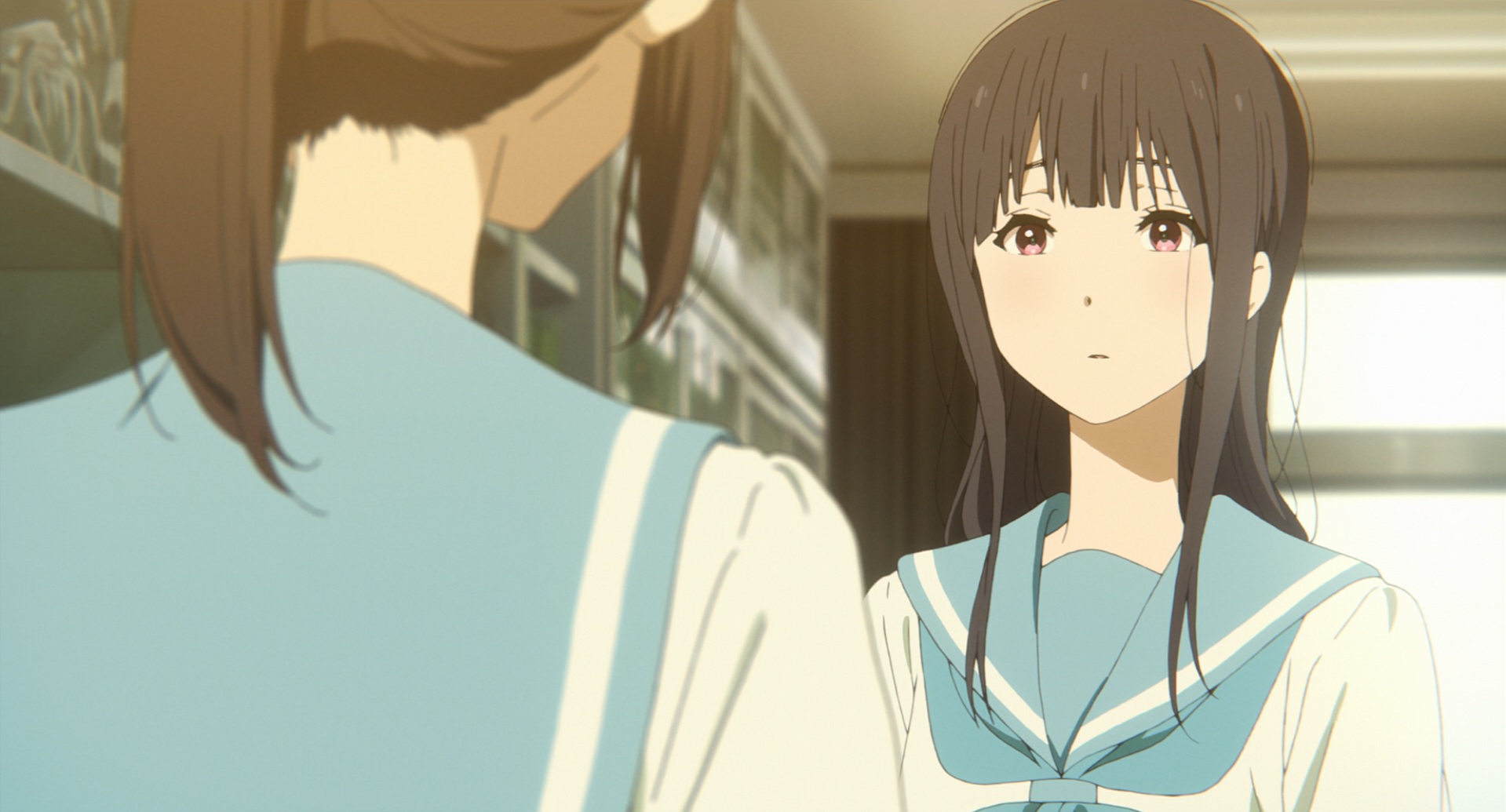
While it operates beautifully as a standalone work, Liz and the Blue Bird’s status as a spin-off further ennobles and clarifies its intent. The film is based on the Sound! Euphonium frachise, which spans novels, manga, anime series and features, and features Nozomi and Mizore in minor roles. Outside Blue Bird, there is little to no implication of sexual or romantic feelings between them. In crafting a spin-off to the anime, the director, Naoko Yamada, and her regular screenwriter, Reiko Yoshida, effectively comment of the lack of representation for marginalized characters in popular franchises by depicting two who are never allowed to honestly represent themselves. Would Liz and the Blue Bird itself have been allowed to declare, in clear terms, that Mizore’s desperation to remain close to Nozomi is largely rooted in homosexual love, if Yamada and Yoshida had wanted that? Maybe. But the Sound! Euphonium anime has a reputation for queer-baiting with its character relationships, and it seems likely that a concrete depiction of same-sex romance wasn’t on the table. If that’s so, then it’s not just the prejudices of her world, but the corporate mandates of media property to which Mizore belongs that ensures she remains repressed.
Blue Bird responds to its source material’s queer-baiting by depicting characters who are unmistakably, unarguably, unambiguously queer, and yet who are not queer, because they are not allowed to be. It subtly distinguishes its political position on representation from that of the anime series by means of aesthetic deviations. For instance, the characters’ necks are elongated in comparison to the Sound! Euphonium anime to connote them as birds; for their cage, the setting before the first and last scenes is claustrophobically confined to their dingy high school. But the film’s prior speculation, about which girl is the blue bird and which is the owner who cages it and later sets it free, may be the wrong framing, a notion the film slyly puts forth itself: late in the film, a lengthy shot shows two birds soaring through the distant sky, drifting slowly and uncertainly towards and away from each other. Neither of them was or could have been caging the other. There are larger, unseen forces responsible for that.
By the end, it becomes clear that it’s actually Nozomi who most closely guards her feelings, and while the film gathers enough clues that we can intuit the wordless ending to be a happy, even romantically satisfying one, they remain just that: clues, signals, codes. They’re traces of a roiling, frightened discovery of the self that operate just under the radar of social notice. They are at once hopelessly inadequate to communicate desire between oppressed identities, and at the same time the last, best hope of doing so. Of course we’re not allowed to hear whatever it is Nozomi says that shocks Mizore in the final shot. To reveal it would be to risk everything.
III. Joint
The lens of queerness is not and should not be the only way to view either Kase-San and the Morning Glories or Liz and the Blue Bird. They reach for a broader scope of themes and character psychology than that methodology could cover, and formulating diverse perspectives on their forms and structures enriches them as works of art. Yet neither must that lens ever be discounted, forgotten, or elided in considering the works, as the omnipresence of the issues they raises is the most critical subtext of both films.
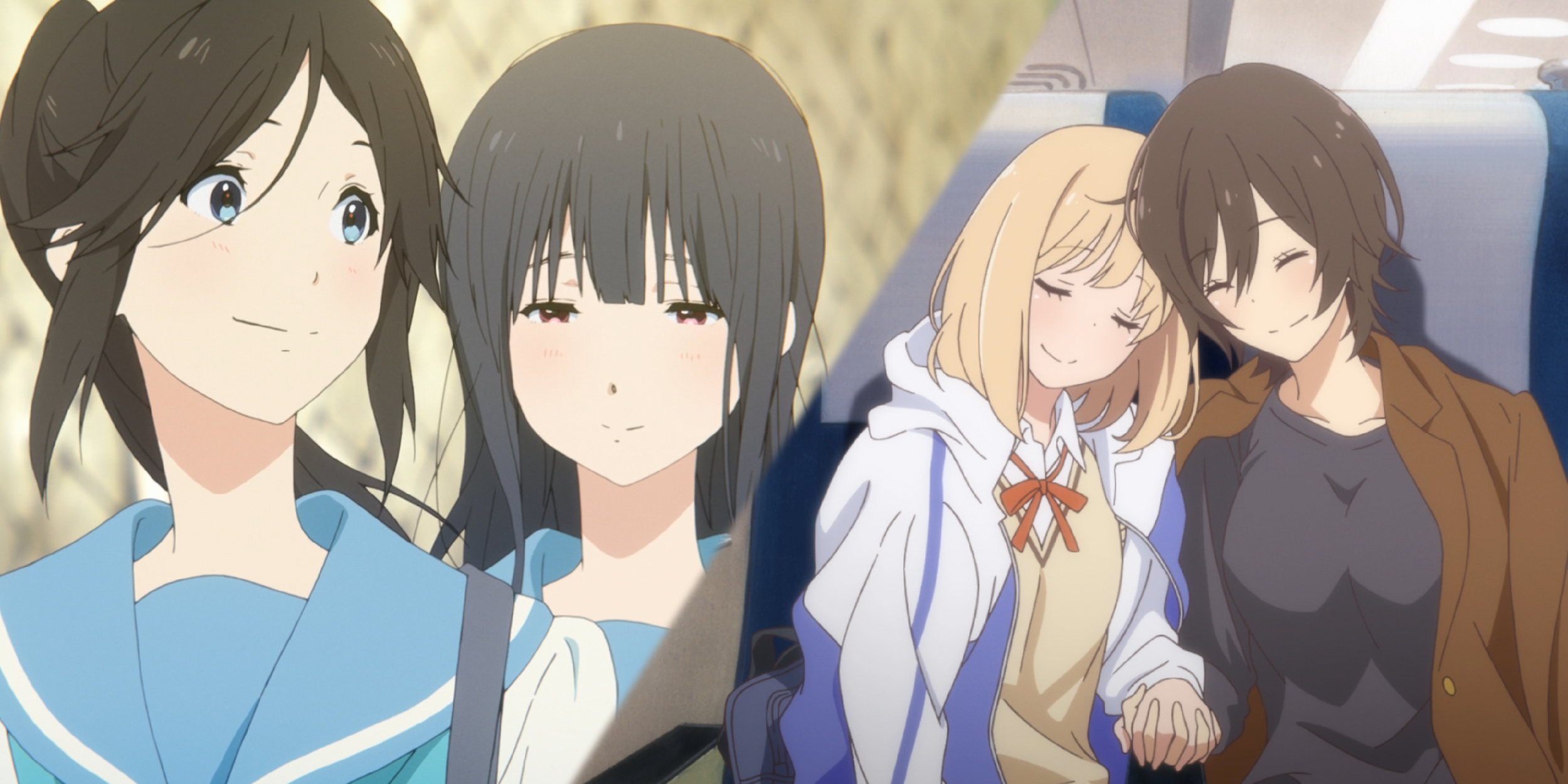
Nobody tells Kase or Mizore or Yamada or Nozomi “no.” Nobody disapproves of their friendship or any desire between them, or their heartfelt need not just for a passing fling, but for a substantive, long-term relationship. Neither film has anything like a villain or antagonist, but this is not the same as saying that nobody is responsible for the challenges these girls face in defining and exchanging their feelings for each other. Rather, the tools of oppression work against them so well that they need not announce themselves. While the texts function on a strictly literal level without acknowledging this subtext, their characters’ choices and behaviours cannot be fully explained without accounting for it. Both films bring queer stories to the screen partially by working within the strictures of mainstream presentations — Morning Glories presents a cutesy, seemingly uncomplicated and conflict-free love story, and Blue Bird operates of a spin-off of a multimedia franchise — that they proceed to deconstruct from within, without breaking the rules of the game. The full scope and implications of their politics can only be proven and understood in the same way as black holes: not by direct observation, but by the way all observable material bends towards them.
But the inescapable gravity well of that metaphor belies both films’ endings, which depict the possibility of happy, healthy, lasting and loving romances between women. Of all the tropes — both in Japanese animation and global representations of queer representation — that Blue Bird and Morning Glories reject, it’s their conscious foregoing of any tragic conclusion to gay romance that is the most satisfying, the most aspirational, and perhaps, in a global culture where only films about LGBT characters that wind up dead or miserable get considered for awards, the most radical. What ultimately inspires and endures from each is their concluding visions of two people who love each other and, somehow, achieve safety, openness, and unity.
VIFF 2017: Wonderstruck
There are many reasons why Wonderstruck fails so disastrously, why it is by a wide margin Todd Haynes’s worst film to date and an eye-popping come-down from his widely-beloved Carol, but the most important reason presents itself fairly early.

by Willa Ross
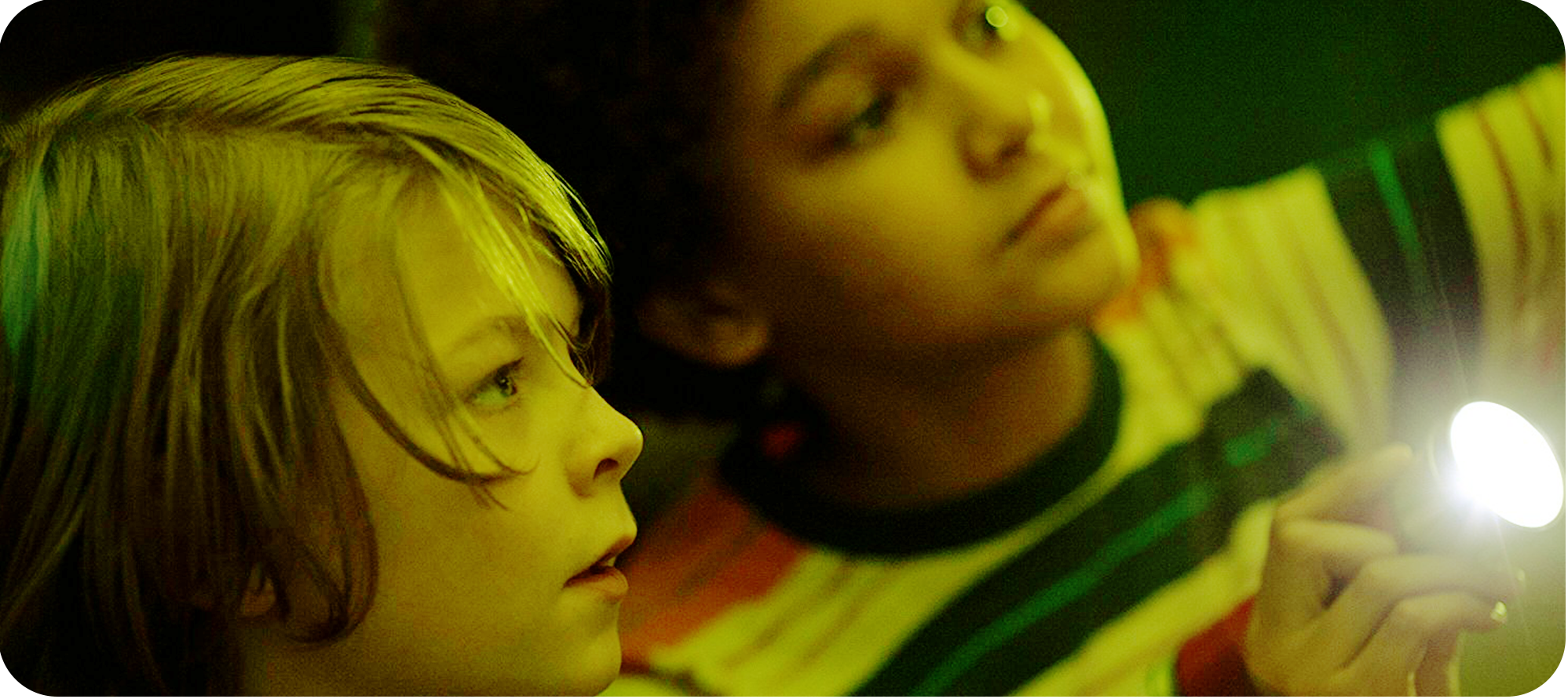
There are many reasons why Wonderstruck fails, why it is by a wide margin Todd Haynes’s worst film to date and an eye-popping come-down from his widely-beloved Carol, but the most important reason presents itself fairly early: its lead actor can’t act. 12-year-old Oakes Fegley, given the always-risky burden of carrying a film on a child’s shoulders, gives every one of his lines the most on-the-nose, subtext free reading possible, and given that the film revolves around his character’s attempts to find his father and his — I don’t know, discovery of wonder? — along the way, this instantly limits the film’s reach. He is never believable as a real person.
Yet, we must believe: believe that when Ben’s mother (Michelle Williams in a brief role that makes little use of her talent) dies without ever having told him of his father, he is consumed with frustration and driven to seek out the truth; believe that this drive persists after a random strike of lightning renders him deaf, to the extent that he spirits himself to New York City circa 1977 to an address he finds on a bookmark; believe that he is deaf at all. The last point is a particular strain; he never shows much concern or alarm at his sudden disability, except to tell a newfound New York friend, Jamie (Jaden Michael), that he is only scared “sometimes. Mostly, it’s quiet.” If there is some personal exchange of feeling or epiphany between these two, it is totally obscured beyond the level of plot, for Michael’s performance as an enthusiastic but socially insecure sidekick is even stiffer and less lifelike than Fegley’s lead, making their interactions awkward and perfunctory.
It’s the writing, however, that brings their budding friendship to the level of unintentional comedy. Brian Selznick, adapting his own novel, is excruciatingly tied to pedantry in every dialogue exchange. The number of times Jamie forgets he’s speaking to a deaf person, is told “I can’t hear you,” writes down his message, and has that message repeated back aloud is stunning, and Haynes, for his part, never truncates nor varies the mechanics of this process. For a film so obsessed with capturing every stumble of communications with the hearing impaired, it falls into bizarre, frustrating tics, for instance: every time Jamie writes a new message on a sheet of notepad paper, he will flip to an entirely new page, regardless of whether he’s used half of the last one or even one tenth of it. It’s a wonder (heh heh) that nobody runs out of paper in this movie.
In attempting to explain the film’s central dramatic collapse, I’ve delayed mentioning its central narrative conceit: for the first two thirds, Ben’s odyssey to New York City in search of his father is frequently intercut with another child’s journey to the city, fifty years earlier. The young girl, Rose (Millicent Simmonds), cuts off her own hair and runs away to New York in search of an actor she seems to idolize (though the full truth of her obsession is more personal than that). Simmonds, in her acting debut, delivers a vastly better performance than the other children in Wonderstruck’s cast, if for no other reason than she has no dialogue: her character has been deaf from birth.
That’s where the commendable aspects of the earlier period material evaporate. While the 70s sequences adopt a fairly standard mixture of contemporary film grammar —colour photography diegetic sounds, spoken dialogue, and film score — the 1927 sequences signal their period by using grainy black and white film stock and stripping out all sound except for Carter Burwell’s musical score. And on that level alone, the 20s scenes do not work, for Burwell follows up his uninspired, ill-fitting music for Carol with a pastiche of musical scores for silent film comedies. Burwell adapts his style to this task like oil to water. For one thing, the tone is not comedic, making his frequent Mickey Mousing (conspicuously matching moments of the score to the exact moments an action happens) feel frivolous and hollowly emphatic. For another, his arrangement and instrumentation is awkward and often distracting, as Burwell frequently places odd musical sounds in the extreme left or right of the mix, distracting one’s ears from the events unfolding on the screen ahead. The more varied soundscape of the later period makes the score less actively distracting during Ben’s portions of the film, but Burwell as usual has no ability to emotionally modulate a moment beyond increasing the volume of his arrangements.
But there are fundamental visual issues with the 20s material as well, for in spite of its partial adoption of silent film grammar, it’s also insistent on maintaining certain standards of modern filmmaking, especially in its lack of intertitles and distinctly modern sensibility of camera placement and cutting, a sensibility that particularly favours synchronized sound in its use of shot-reverse-shot setups for dialogue. This would be more bearable if Haynes displayed much in the way of inspiration with those modern camera placements, but there are hardly any moments in Wonderstruck when the placement of the frame or the use of a particular lens feels anything but functional.
But the last and most critical flaw with the 20s material and its parallel play with the primary narrative of the 70s is that it has no reason to be. Not only are the beats of each child’s New York Story frequently repeated in full, they seem to be building towards a momentous connection that amounts to an underwhelming familial reveal in the 70s portion of the film. There’s little reason to parallel these two stories, except to demonstrate a parallel, and even the lack of diegetic sound as a signifier of deafness is inconsistent between them, a mark of loosely-justified gimmickry.
By the time the film ends in a risible sequence that mixes elaborate dioramas, rapid cutting, lighting flourishes, and a barrage of questions that ought to be rhetorical but aren’t (“What is this” and “What’s going on” and “How did you find us”) — none of which has a discernible intent — it becomes clear that it's not just the cribs from silent cinema: the whole effort is no more than a series of underdeveloped structural and stylistic concepts, tied together through a contrived emotional non sequitur of a plot twist. That I haven’t touched on many of Wonderstruck’s smaller failures of craft — nonsensical eyelines and blocking, egregiously unnecessary flashbacks, conspicuous loose ends — speaks to a project that I suspect either got away from Haynes early on, or one that he was never invested in in the first place.
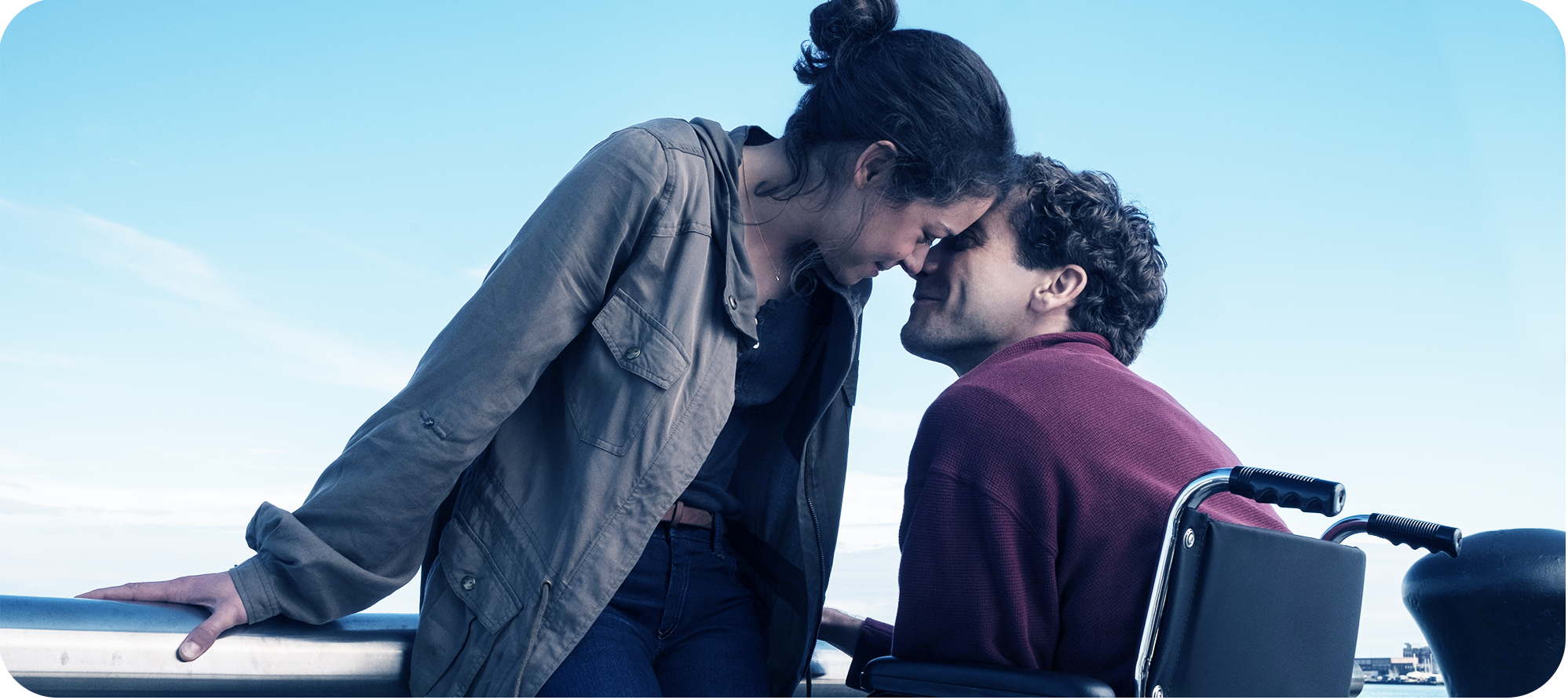
Stronger (2017) — Stronger Things Have Happened
Stronger feels, in most every respect, like a film that overlays the known facts of Jeff Bauman’s trauma and recovery on top of a conventionally satisfying dramatic structure.

I am lucky to say that neither I nor anyone I know have been personally and directly affected by it. The closest that terrorism has come to touching my life was the Boston Marathon bombing, to which I felt some affinity — I have family who have run Boston in other years, and having run a marathon myself, I could keenly imagine the horror. Yet even this is not enough to claim a full understanding of the experience, a collective trauma that forces the world to shift, that can ruthlessly end or destroy or cripple whole lives beyond all reason, an act intended to reduce people’s existence to political symbols of loss or victory. All this, yes, and an individual trauma as well, for no statistic or overview of victims can explicate the full, unique impact a moment can have on a single life. It's easy to fall prey to this reduction, and it can even arise from feelings of empathy and love.
Take Jeff Bauman, whose legs were shredded from his body on that day in Boston, and who was photographed being wheeled away from the scene in that state, ashen faced and broken. The phot made a star of Bauman internationally, but particularly locally, and his survival itself became an embodiment of his city’s mantra: “Boston Strong.” He threw a pitch at a Red Sox game. He co-wrote a bestselling book about his experience. Now there is a biopic directed by David Gordon Green, Stronger, based on that book, an ostensible effort to peel away the deceptive skin of myth and celebrity to behold the humanity underneath.
Would that the filmmakers had fully thought through how and why they wanted to do this! Stronger feels, in most every respect, like a film that overlays the known facts of Bauman’s trauma and recovery on top of a conventionally satisfying dramatic structure. Jeff (Jake Gyllenhaal) has a brief stint of focused determination after the bombing, a time when he wins his ex-girlfriend Erin (Tatiana Maslany) back over, makes a series of uncomfortably demonstrative public appearances, and charts his rehabilitative course, but he slowly sinks into self-loathing and despair. The possible reasons for this fall are alluded to — he had an unreliable streak for a long time before the bombing, he doesn't want to disappoint his family, he hates himself for being hurt when others died, he hates the world for hurting him for no reason — but are never elaborated upon or explored. Instead, they’re window dressing for a conventional comeback story, which climaxes with his pitch at the Red Sox game for seemingly no other reason than it was a pretty big, prominent event in real life.
That climax doesn't seem to tie into him resolving any personal demons. Instead, it comes as Bauman realizes that he has been a beacon of hope for others, and decides to finally fall into that role. But why? How does that connect to the other psychological issues that have seemed to bring him there? It certainly flies in the face of the film’s earlier disdain for the celebritizing of victims. The film spends so long decrying Bauman’s treatment as a political prop by the public and his family that his sudden euphoric acceptance of that persona exposes the entire movie as insincere.
There are flashes of a better version of the story here, and director David Gordon Green would have been far better off recognizing the principles of these moments and sticking to them. Most memorable is the moment when Jeff has his legs’ bandages replaced after their amputation. Green plays almost the entire scene in a single shot, with Bauman’s face in close up on the extreme right of the frame and his legs out of focus in the background as he winces and shouts through the procedure. Eventually, Erin’s face emerges on the left of the frame, turning the image from one of isolated suffering into interpersonal connection and consolation. Other scenes would have benefited from this approach; one has Bauman sitting on the toilet as his family yells at him to hurry up and join them while they watch sports. The scene cuts back and forth from the living room to the bathroom as Jeff struggles and muffles his own screams of frustration. Why cut away from the bathroom at all, when the perspective of the living room is irrelevant to the scene, and the tension and familial disconnect would have been much more acute if we watched Jeff on the toilet as we only heard his family through the door? It's a film that would seem to demand an empathetic point of view, but Green seems unaware or uninterested in maintaining a consistent perspective, even though his cast (who are faultless to the extent that the muddy script allows them to be) are more than up for the task of such scrutiny.
The formlessness of the camera positioning and cutting is an issue that runs deep in Stronger. One sequence cuts between an exchange between Bauman and Erin over dinner, where he suggests that she join him at his rehab sessions sometime. As they discuss this, the scene cuts repeatedly to a wide Jeff doing laps in a swimming pool. There’s no discernible reason for this, no parallel, no metaphor, no counterpoint. It seems to be there only to liven up the staging of the scene, but it's exactly the sort of over-compensatory approach that makes Stronger so dramatically inert.
It doesn't help that, besides an occasionally inspired frame, Green and his cinematographer Sean Bobbitt’s approach to camera coverage is thoroughly underwhelming. Their long lenses and arbitrary (frequently unattractive) scope-ratio compositions often confuse any sense of who’s looking at whom, doing what, going where. This is not the sort of camera placement that justifies breaking the axis of action, yet Green does so with the confidence of Ozu, and the results are always deleterious to scenes’ graphic and spatial integrity.
Why is the score full of plodding, on-the-nose piano? Is Erin being guilted back into her relationship, and why does the film ultimately brush this concern aside in favour of a conventional romantic coupling? How culpable are Jeff’s friends in enabling his turn to alcoholism, and why does he (and the film) so unequivocally embrace them by the end in spite of this? Why are there so many rambling conversations that reveal little more about the people having them except that they are blue-collar folks from Boston? Rising from adversity is a worthy theme in itself, to be sure, but it's not enough to gesture towards it without developing a social or psychological framework to hold it up. The film is so disconnected from whatever sense it means to make of its own subject, yet the moments of clarity or effect indicate that there is an earnestness behind Stronger, and that makes it difficult to denounce as cynical. It is merely irresponsible.
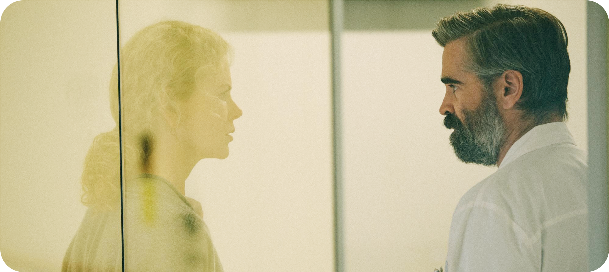
VIFF 2017: The Killing of a Sacred Deer
I can’t remember the last time I saw a film that presented a fairly straightforward, coherent narrative that was so unswervingly and gleefully willing to break rules of craft as The Killing of a Sacred Deer.
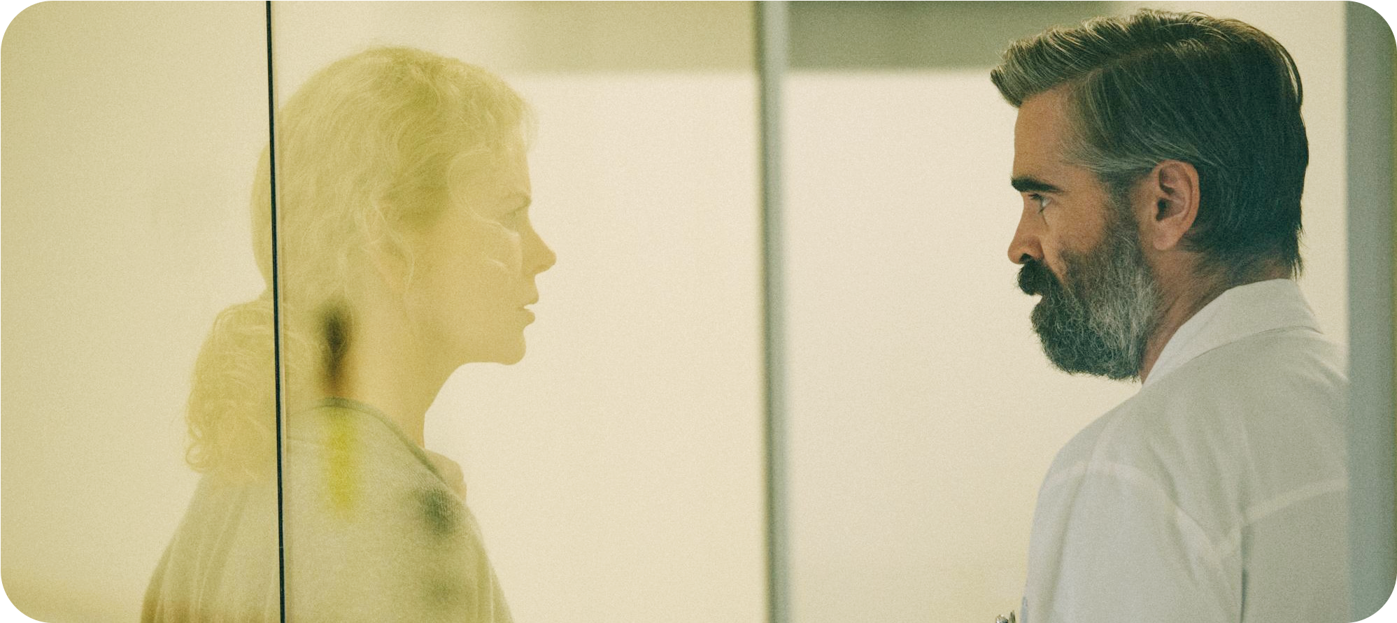
by Willa Ross
I can’t remember the last time I saw a film that presented a fairly straightforward, coherent narrative that was so unswervingly and gleefully willing to break rules of craft as The Killing of a Sacred Deer. If I'm being honest, this endears me towards director Yorgos Lanthimos, his co-writer Efthymis Filippou, and the film itself a great deal in and of itself. Maybe even more than they deserve. But there is merit to movies that are so willing to rend our viewing sensibilities limb from limb without being cruel about it, and while the film is mercilessly dark and biting, it would be a long reach for me to call it cruel.
The first shot of The Killing of a Sacred Deer may seem cruel, in a graphic way: it slowly zooms out from a beating heart in an open chest cavity as it’s being operated on. It’s a sardonic nod to the coming dissection of polite family life that will show the grotesque processes that motivate people, yet go conspicuously unspoken or unnoticed. While not every beat of the film’s assault on filmgoing complacency is so retrospectively clear in its intent — after all, clearly delineable intent is one of the most sacred of audience expectations — that clinical tearing up of surfaces is no accident. As we get to know Doctor Steven Murphy (Colin Farrell) and his family, one of the first stylizations to become obvious is that everyone speaks in flat tones and monorhythmic cadences, removing charisma from conversation. Everyone seems bored with their own persona.
And so they continue their abrasively untainted upper-class lives, even though every fibre of the film screams at us that something is wrong: shots are wildly unbalanced in their composition, they frequently slow-zoom towards a part of the frame other than its main subjects, focal lengths cut suddenly from a sickening fish-eye wide lens to a space-flattening telephoto long lens, the musical score is thin, shrill, and atonal, dialogue is sometimes buried in a muddy mix or so rapid it’s unfollowable, and all this dominates the story of Dr. Murphy, his wife Anna (Nicole Kidman), and his children Kim (Raffey Cassidy) and Bob (Sunny Suljic) long before anything goes incontrovertibly wrong with it.
Over its length, the film doesn’t escalate in its use of this trickery in cinematography and sound, but it more than makes up for this with the gradually mounting absurdity of the scenario. It would be telling too much to reveal the full extent of the disaster that befalls the Murphys. Suffice to say, it revolves around a teenager, Martin (Barry Keoghan), whom the doctor has formed a close bond to sometime before the film begins. Their friendship is platonic, but Steven seems inexplicably unwilling to tell his family about it. Farrell and Kidman’s slow turns towards mania (viper-eyed anger and intensity from Kidman, panicked idiocy from Farrell) make their performances especially magnetic, but Keoghan achieves something special as well, an undefinable uncanniness and flatness beyond that shown by anyone else whichsignals to us that, even among these people who act like space aliens imitating humans, there is something very, very wrong with this boy in particular.
And everyone seems to realize it, except for Farrell’s hapless patriarch. It gradually becomes clear (to the audience and some of the characters themselves) that, even though he is a highly respected and accomplished heart surgeon, Steven Murphy is not exactly the sharpest tool in the shed. Not only is he caught in a hopelessly selfish denial of the danger facing his family, he can’t conceive any possible means of responding to it except the first impulse to flit into his head; those impulses range from parodies of the quotidian denials common in lifestyles of wealth and privilege, to kidnapping and beatings without any clear aim except to assert his own control and sate his ego. In its surreal climax, he arrives to his final, inevitable decision in both the most cowardly and ludicrously unwise fashion humanly possible. It’s one of the most hilariously straight-faced eruptions of over-the-top foolishness I’ve seen in a film for a long time.
The stupidity of its central character is a method of Lanthimos’s efforts to disembowel bourgeois smugness, but the beating heart at the center of it all is the film’s embrace of the unknowable. It’s never clearly explained how, exactly, the plot against the Murphy family works, or why it doesn’t work the way we’re explicitly told it will, or what granted their tormentors the ability to wield their terrible power. Other loose ends, be they plotholes (how could the police possibly not get involved at that point?) or characters’ relationships (just what the hell is going on between Kim and Martin, exactly?) or other details makes it difficult to draw clear lines defining many of the film’s parts as allegorical farce, magical realism, or surrealism. Even its title is inexplicable — it seems a reference to Lanthimos’s concerted evisceration of “sacred cows” that uphold the self-afforded status of the rich and comfortable, yet there is no deer in the film that would seem to justify changing the idiom from “cow” to “deer” (unless I’m missing some obscure allusion, but that would only prove my point).
If The Killing of a Sacred Deer has a weakness, it’s that its multivariate shattering of norms and expectations suggests a more complex work of psychological horror and satire than what really appears to be there, even with hindsight. There isn’t much shading or context given to its cry of “the privileged nuclear family cannot acknowledge taboos or admit their hidden perversity!” That’s a worthwhile complaint to lodge, and a fitting occasion for playfully needling its subjects (and its audience), but also an awfully thin subtext for a work so eager to overwhelm with conspicuous stylistic choices. Still, that lack of social depth doesn’t undermine just how dense and delirious the experience of watching this is, qualities that would make this a worthwhile effort even if it had no political targets to legitimize it as art. Too few films are willing to use form to twist the knife of tension or set their audience off-balance, and a film that commits to it so wildly, with such a wicked sense of humour, is a fairly rare beast, especially in an arthouse community that can sometimes overvalue solemn austerity.
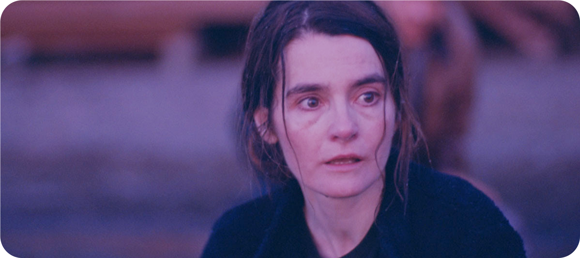
VIFF 2017: Never Steady, Never Still
A film that radiates compassion and nuance in every moment it spends with its Parkinson’s-afflicted mother Judy (Shirley Henderson), even as the means of telling the story can waver in effectiveness.

by Willa Ross
Stories of people with Parkinson’s — especially in rural areas — are rare, and that’s not totally without good reason. Such diseases require a personal closeness to the subject matter to do well, and too often, art about diseases is platitudinous, cynical, or otherwise reductive. One certainly couldn’t accuse Kathleen Hepburn of not being close to her writing and direction in Never Steady, Never Still, a film that radiates compassion and nuance in every moment it spends with its Parkinson’s-afflicted mother Judy (Shirley Henderson), even as the means of telling the story can waver in effectiveness.
The film splits its focus between Judy, who is in her third decade living with the illness, and her son Jamie (Theodore Pellerin), who hopes to save money and leave town in the same way his childhood friend did. The 19-year-old Jamie is struggling with both an abusive boss at a back-breaking job on a natural gas plant, and with turbulent doubts about his own sexuality (he shows strong romantic feelings for his departed buddy, which are implied to be mutual but unrevealed). In spite of their ties as a family, there’s little thematically connecting their two stories, besides a pervasive feeling of being trapped in the sheltering backwoods of northern British Columbia.
That linkage is enough, but it’s a slim one. It would be too charitable to ignore that Never Steady, Never Still does little to elaborate on the precise socioeconomic conditions that could ensnare someone in a place they don’t want to be, free country or not. Financial roadblocks and linkages are foggy, the consequences of a job being won or lost are scarcely felt, the function or consequence of being anything but heterosexual in a small community goes unremarked. It would, however, be uncharitable not to acknowledge that its aims are overwhelmingly internal, concerned with the plight of the unknown and helpless. At the same time, its frequent use of locations and details to establish a sense of place (a personal favourite, as someone who grew up in small-town BC: the grocery store is part of the Overwaitea chain) makes its social simplicity stand out as a missed opportunity to further inform and complicate its main characters’ lives.
In Judy’s case, however, that life is compelling and complicated in its own right. For anyone who’s been close to somebody enduring Parkinson’s, Shirley Henderson’s performance — stooped over, violently shaking, whimpering at the overwhelming struggle of something as simple as putting on a boot, frighteningly small and weak — will ring unsettlingly true. It’s all the more remarkable for its expression of inner conflicts and individuality that go beyond a purely technical expression of illness and make Judy feel like a real, breathing person. Judy faces her life with a carefully learned and studiously generous grace, while at the same time she pushes herself beyond her capabilities. It’s a performance that rests on a fulcrum of guilt and memory, marred only by the fact that, except for her external circumstances, little about her seems to change or develop. Nonetheless, even though much of her dialogue is too small and mumbly to clearly make out, there’s rarely doubt to what Judy is thinking or feeling, the mark of both a very skilful performance even under enormous constraints, and of delicately revealing dialogue (“he would have been bored to death in there”, she quips after a funeral).
Vocal audibility becomes much more of an issue in the film’s several instances of voiceover narration by Judy and Jamie, which, particularly in Judy’s case, are too fuzzy and difficult to hear for crucial, poetically revealing moments. These voiceovers suffer a little for their writing, which can fall victim to ostentation and on-the-nose metaphors, but also have gems of simple, aphoristic clarity, like “If you’re better than this place, then why is this place so hard?”
The cinematographic schema of the film is stylistically consistent, if not always suited to the moment. Never Steady, Never Still uses handheld cameras, usually with longer focal lengths, often playing out entire scenes in long, single masters. This emphasis on duration — frequently lingering on Judy’s painful struggles to accomplish mundane tasks — is suited to the film’s theme of suffering in (a) place, as simply existing attracts obstacles that seem too great to bear. The framing, however, is less consistent, particularly the camera’s tendency to place objects in the foreground as it watches long conversations play out. This gives a voyeuristic overtone to scenes that surely wasn’t intended, as Never Steady’s perspective is clearly intimate and empathetic, not distanced observance.
On the other hand, the blocking within those frames — and the use of gentle, unassuming pans to capture tics and gestures that sculpt people’s motivations — is excellent throughout. While Hepburn may lean a little too heavily on filming people from behind, the body language, movements, and positions in any given scene are carefully considered and frequently powerful in their own right, from moments of overt visual tragedy (e.g. a repeated shot which, the second time around, is absent a character) to subtler invocations of a scene’s dynamics. A favourite example: a pickup outside a grocery store, wherein the dense crosshatching lines of shopping carts make Jamie seem to be navigating a metallic maze in order to close the distance with his quarry.
In spite of having a clearer development over the film’s length, Jamie’s story is the less successful of the two leads. It’s clear what afflicts him — his lingering feelings for his friend, his need to stay close to his ailing mother, his unbearably hostile work environment — but less clear what drives him, what he dreams about when he’s not full of misery, besides a coming-of-age, discovering-sexuality story that has, at this point, become fairly familiar in independent cinema. This is exacerbated by Pellerin’s unsteady work in the role: at times, his bubbling frustration or curiosity or fear are perceptibly warring with his studied, somber stoicism; at times, his readings are simply monotonous.
Similarly, the music by Ben Fox (his feature debut) strikes the same notes far too many times. Long, warm, synthesized notes that swell then fade, moving gradually, melancholically from one tone to the next, are a fine way to express the slowness and isolation of life in a small community, but they also become repetitive and, therefore, more obtrusive and artificial-feeling as the film goes on. It feels like both a symptom of the film’s issues with creating an arc and of a lack of an overarching musical structure that the music conspicuously stays flat.
I say that the film doesn’t create much of an arc; at the same time, it never feels like less than a living, breathing object, marked by someone who cared deeply about the characters and was hell-bent on presenting them faithfully. Never Steady, Never Still’s successes in humanism make it a rewarding film in its own right, and while it feels its contemplative aims are misdirected into a wayward lack of forward motion, the tonal control and attention to detail make the shortcomings in its craft feel more like an exciting starting point for Hepburn’s career in features than a dead-end.
VIFF 2017: Fail to Appear
The camera of Antoine Bourges’s freshman feature Fail to Appear observes offices and coutroom halls and plain-walled living rooms and the people inside them patiently, dispassionately, gently.
by Willa Ross
The camera of Antoine Bourges’s freshman feature Fail to Appear observes offices and coutroom halls and plain-walled living rooms patiently, dispassionately, gently. The person who forms our entry point into this systematized world holds us at arm’s length, just like the film she inhabits. She speaks precisely, in a low, raspy, voice that may be betraying nervousness, or maybe that’s just her timbre. Her job is to keep people from falling through the cracks, and she’s new to it. A coworker tells her, to her shock, that sometimes she will have to juggle as many as 30 concurrent cases, and to her this seems impossible. She's assigned a new case: a sheet of paper describes his history, his issues, and it’s a lot to take in, but some key facts pop out: his name is Eric Edwards (Nathan Roder), and he’s been charged with theft and failure to appear in court. The support caseworker, Isolde (Deragh Campbell), hopes to secure his release in an upcoming court hearing.
At one point, Isolde recounts that she came to social work as a career because of the empathy she felt for literary characters, an experience she hoped she could translate to real people. But she is plainly awkward and uncomfortable in her work, where the people tend to be much more opaque and unflappable than the characters in a novel, and the only “literature” she reads is the hopelessly clinical forms on her desk.
The presentation of these forms shares its aesthetic with intertitles in silent films: the text is presented in flat, head-on close-up, and when it extends past the limits of the frame, it scrolls smoothly upwards. In spite of interrupting visual continuity, intertitles are dialectically suggestive in their juxtaposition of text and image, and by selecting words that complemented their surrounding footage, they bisect cinematic style while the sequence remains whole. Fail to Appear takes full advantage of that. For all its seeming simplicity, this is a work of surprising formal dexterity, and the glimpses of forms, emails, and other documents leverage an epistolary effect to distance us from the people they describe and address, highlighting the contradictions inherent in the cataloguing of an individual person.
These head-on shots contrast strikingly with the rest of the film, which carefully arranges its characters in dynamically composed, lengthy, mostly-static takes so that they are clearly presented to the audience with soft, attractive lighting. The result of that overriding approach is a surprisingly painterly approach to people occupying aggressively sterile spaces of blank walls, browns and beiges. Eventually, Fail to Appear turns this dichotomous approach between procedure and humanity decisively on its head, with the most direct moment of human connection and expression occurring in a climactic shot of a computer screen.
In form and content, Fail to Appear is in many ways a film that complements the Dardennes’ Deux Jours, Une Nuit: that film is an open, overtly emotional expression of an individual’s experience of mental illness, with elaborate camera movement but flamboyant colour direction; Fail to Appear is more subdued in its palette, camerawork, and exposition of character. Both movies have a deceptively unassuming style, and both of them suggest a slightly unreal, allegorical approach to their social contexts — could Isolde plausibly be so quiet and uncommunicative with people, even being so new to her work? — but Fail to Appear’s focus is on the support networks and institutions that operate around (or in spite of) the people they benefit (or don't). Its resultant experience is thus more collective than individual.
Collective, but not impersonal. The film is neatly divided into two halves, respectively dominated by Isolde and Eric, though each person’s presence looms unseen over the other’s story. Bourges crafts an almost effortless sense of suspense throughout; in the first half, he makes Eric an unseen enigma. When Isolde calls Eric’s mother and asks her to appear in court to support her son’s release, the mother sighs, says her son is “an adult now”, and hedges (the moment in court when we realize whether she’s chosen to attend or not is one of the film’s numerous understated but emotional reveals). Later, Isolde carefully withholds from Eric the full nature of her phone conversation with his mother, a moment that once again plays out without underlining its drama, relying on the audience’s attention, the smallest behavioural nuances from the actors, and the exacting mise en scene to draw gravity and tension without breaking from the film’s procedural scheme.
In another sequence, Eric sits down and calmly endures what seems to be a schizophrenic episode, responding to voices that we cannot hear. The moment is unnerving, but soon after we see Eric in moments of quotidian tenderness as he helps his stepfather build furniture, or works on his own music production. It's the sort of unromantic complication that Bourges seems to favour in his study of networks and systems, but it only occasionally peeks through in a more direct gaze on a truly intimate moment.
Fail to Appear is a film of striking bifurcation, but it’s also a cumulative experience that both rewards close attention with revealing details, and forces some speculation and ambiguity in reading its central relationship, or lack thereof. It may be a good sign that I’d say there needs to be more of it, but truthfully the 75-minute runtime doesn't give it much time for that careful accumulation to build up as fully as it could, leaving its last flourish, where plaintive feeling tries to burst through a PC screen’s diodes, somewhat lacking the sense of revelation when it ought to be fully piercing its characters’ guarded exteriors, though its raw conceptual power is undeniable. Nonetheless, this is an intellectually absorbing and sometimes surprisingly moving debut, stunningly confident in the risks it takes, rightly assured in its reasons for taking them, and precisely the sort of new voice in Canadian cinema that ought to be recognized and bolstered.
Dunkirk (2017) — Rhythm and Blues and Oranges
If you were to concoct a movie concept for Christopher Nolan to direct that would play to his strengths and mitigate his weaknesses, you could certainly do far worse than Dunkirk.
by Willa Ross
If you were to concoct a movie concept for Christopher Nolan to direct that would play to his strengths and mitigate his weaknesses, you could certainly do far worse than Dunkirk, a war movie that rigorously adheres to the perspective of British men involved in one of the most triumphantly remembered wartime losses of any national memory. The concept is: to intercut between three separate stories of different time spans, one following those on the beach being evacuated for a week, one following a small boat of civilians who cast off from home to offer whatever help they can in rescuing the troops for a day, and one following a fighter pilot’s hour-long mission to interrupt the German air force’s attempts to strafe and bomb the fleeing British navy into oblivion; to follow numerous characters and plot strands without especially emphasizing their personalities or any kind of “arc”; to stage the entire film as though it were one almost never-ending suspense set piece, closing the noose throughout. Its divergences from that concept and its principles are the primary source of its failings, but it also shows signs that Nolan may be too enmeshed in the commercial sensibilities that have made this, his longtime dream project, a reality. It is precisely because Dunkirk is his best film in over a decade (a compliment, in my estimation, if a slight one) that it also lays out the clearest case yet that he may never again make something as uncompromising and dangerously unsatisfying as Memento.
Nonetheless, hopefully the successes here portend new directions for Nolan, as they are the result of creative choices that would be risky for anyone, one of which is that the tight focus on the evacuation distances this from the excitement of a combat film. He never puts German figures or faces on screen, giving no greater representation to them than their airplanes. Besides mostly eliminating combat from the proceedings, the unseen enemy goes some way towards Dunkirk's resemblance of a disaster movie, abstracting the threat of death into something as random as it is inevitable: bomb after bomb, bullet after bullet, torpedo after torpedo shreds across the beaches and escape ships, the desolate sands and seas withstanding the explosions and absorbing the corpses, unmarred and impassive, while soldiers die by the thousands waiting in line for ships that may never come. Early on, the film's single most striking shot literalizes this systematic yet arbitrary procession of death, as one soldier cowers in the sand in the foreground while we watch an out-of-focus line of men in the same position blasted by bombs, eradicated one by one as the sand explodes from the ground closer and closer to the camera — until it stops short.

It's an atmosphere thick with dread, and the film's commitment to its concept produces and holds that atmosphere for most of its running time. But two of the three stories break from that schema in a fashion that suggests Nolan may have been more curious about the effect of splitting the standard duties of conventional storytelling among different strands than he was about removing them altogether. The civilian boat, for instance, has a hard-nosed but passionate older man, identified only as Mr. Dawson, (Mark Rylance) taking the aid of two teenage boys, one his son (Tom Glynn-Carney), the other a ship hand (Barry Keoghan), as he takes his vessel across the Channel to France himself rather than letting the Royal Navy commandeer it. Rather than that sense of encroaching death, of catastrophe avoided by the narrowest of margins, their story relies more on psychodrama. That kind of material has never been Nolan’s strong suit, given that he tends to populate his films with characters who are too thinly drawn for interpersonal fireworks to register much beyond the surface, just one of many ways that broad strokes have been the auteur’s bread and butter, and details his achilles heel. When that psychodrama goes haywire, the aftermath is maudlin and unrevealing, the sort of pitying ode to sacrifice that more suggests an effort to satisfy an audience’s desire for heroes than an effort to say anything interesting about who they were, what they thought, and what their sacrifice may have signified beyond tearjerking sentiment. Was it right or responsible for Dawson to take his ship out himself, a prideful act that likely caused far more suffering than if he had let the Navy take it from him? It’s a fascinating question, naturally suggested by the story, so much so that it’s staggering that Dunkirk seems either unaware of it, or unwilling to address its moral complexity at the expense of its concluding nationalist strains.
In the pilot’s story, much the opposite problem takes hold, as Nolan reaches for pathos in a feather-light story and a character who barely registers as anything more than a mask and muffled speech (played, in what must be a rare moment of witty self-awareness for Nolan, by the film’s most famous actor Tom Hardy, who last worked with Nolan playing the infamously-masked and indecipherably-voiced Bane in The Dark Knight Rises). This story is at its best when it accepts that it is the most anonymous of the three, as a Spitfire pilot named Farrier hunts for Germans long after his fuel gauge is broken. The cracked glass over that gauge — a timer that demarcates how long Farrier has before he must land or die — is the most potent metaphor for the film’s fragmented treatment of time. As all three stories work towards a common point at different rates, the sense that time is out of everyone’s hands and that death could come at any time is omnipresent. Yet Farrier (and we) can’t help but keep glancing at the broken gauge.
Unfortunately, in order to motivate Farrier, he must have a mission, and it just so happens that his mission is to engage Germans in combat, the only prominent violation of the film’s otherwise well-guarded avoidance of definable antagonists. This might be an acceptable concession, except that Nolan is not particularly good at staging combat, be it fisticuffs, shootouts, or dogfights. Rather than any sense of logical decision-making or escalating spatial tension, his oppositional action scenes inevitably boil down to a series of events without a perceptible causal chain, i.e. this happens, then this happens, then this happens, without a “because” or “therefore” to give weight to the battle or meaning to the decisions. And so it goes when Farrier comes across a foe from the Luftwaffe: he swerves, fires, misses, swerves again, fires, misses, breaks chase, swings back, and finally gets a killshot, and there is little means to explain why one moment follows the next.
Corresponding to its dullness when taking the perspective of a hunter, Dunkirk’s best scenes are most always when it plants us in the boots of the hunted. The beach story — titled “The Mole” in ominous contrast to the other, plainer titles, “The Sea” and “The Air” — is genuinely nightmarish and surrealistically frightening in a way his fairly mechanical depiction of dreams in Inception never approached. “The Mole” is a feedback loop of failure, as we follow the mostly silent trials of Tommy (Fionn Whitehead), the only survivor of a squad we see picked off in the film’s prologue. Tommy, it seems, is among the very last men to arrive at the evacuation zone, which puts him last in line for rescue. Seeing this, and realizing that explosions will rock the beach constantly until he leaves or dies, he tries again and again to escape the shoreline, meeting bureaucratic failure at best, catastrophic near-death (by drowning, burning, bombing, or even friendly bullets) at worst. Meanwhile, the film gives a surprising (and admirable) amount of screentime to British officers who don’t appear to have much more influence over their fate than anyone else stranded on the wrong side of the English Channel, primarily Commander Bolton (Kenneth Branagh). Instead of the strategizing or rousing speeches an officer would typically deliver in a film like this, their time is spent either confirming that yes, their only possible option is the worst-case-scenario, or mournfully reflecting on their helplessness. (“You can almost see it,” Bolton says, looking over the water, “home.” But the horizon line is mercilessly straight and clear.) That Branagh gives what seems to be a terrific performance is a shame, because as long as Nolan insists on burying dialogue in his sound mixes, the performances in his films can scarcely do more but “seem to be.” Elsewhere, the sparseness of spoken word permits Nolan and regular sound designer Richard King to indulge on their thick, detailed sound designs without effectively muting important dialogue, but it's inexplicable that the dialogue issues persist, since they're the most universal and longstanding complaint about the technical elements of Nolan's films.
By default, then, Whitehead is best in show. I don’t mean that as a backhanded compliment; his paucity of spoken lines allows his work to exist solely on his weathered, frightened face, unblighted by the overwhelming sound mix. The most impressive feat of Whitehead’s work here is the growing sense that Tommy knows that he can’t possibly survive this, and attempts escape only because there is no other choice but to swim into the water and die, as he grimly watches one man do. In a cast packed with unfamiliar faces but featuring a few bona fide stars, it’s telling that his — at once wide-eyed and despairing, accepting that each new escape is, at best, a distraction from the inevitable — is the most memorable.
So “The Mole” is handily the best part of Dunkirk’s three-pronged story, and yet I’m not sure that the film would be better with its other thirds excised (though I’m curious to see someone try with an inevitable fan edit). Perhaps the most obvious means in which Dunkirk appeals to Nolan’s gifts as a filmmaker is his structural ambition and rhythmic grandiosity. That tends to manifest in puzzle-narratives that take the moment the last puzzle piece clicks in as their emotional climax, and in intercutting that takes on an operatic intensity. While both of these habits and their merits are often scuttled by the sloppiness that tends to mar his screenplays, here they’re mercifully free of any gaping plot holes or laughable character turns. It's hard to overstate just how vertiginously magnetic Lee Smith’s editing is, be it the tightening corkscrew of its nested timelines, which converge on the climax of the evacuation with breathless certitude, or the raw, moment-to-moment decisions, as in the late scene where a German plane comes in for a bombing run of men on the beach, and Smith gives the overwhelming majority of screen time to the men who are about to be bombed, both extending the moment to thunderously huge proportions and giving the plane an almost cosmic frightfulness by keeping it a mostly unseen presence. The one and only edit I take issue with is the one that leads into the final shot, a use of a fade to black and hard cut so bizarre and disjointed that I keep wondering if something's gone over my head. I even suspected that my theater's projector may have suffered some sort of malfunction; whatever the case, the effect was far more jarring than any intent suggested by the material.
That this movie is replete with fantastic cutting is a particular boon, since the shots that make up the montage are, in and of themselves, underwhelming. How, exactly, the film has received its reputation for superlative visuals isn’t clear on the merits, though I’d wager an extensive marketing push for seeing it in an IMAX theater affected a lot of folks' impressions before they even reached their seats. Dunkirk makes use of a fairly extreme dichromatic palette, limiting its colours to fall within two hues. As the film begins, with its faded reds and cyans, one might assume that Nolan is replicating the look of an old, two-strip technicolor film. There are two major issues with this theory of Nolan’s motivation, and the first is anachronism: by 1940, the old red-and-blue process had been obsoleted by a more polychromatic three-strip technicolor, famously used the year before in The Wizard of Oz and Gone with the Wind.
The second issue is that Dunkirk’s governing hues change from scene to scene, and sometimes even from shot to shot. While the film starts with a two-strip look, its median colours are run-of-the-mill teal and orange, and it’s hard to think of any way that palette choice contributes to the sense of place or emotional impact, other than to make an ensemble war film look like any number of tentpole blockbusters made in the 2010s. Even more surprising, given the technical demands and pedigree involved, is how inconsistent it is: within a single scene, a character may step out of a boat’s interior with his face as orange as a carrot, then, after a single cutaway, his skin will have calmed into a less-intensified apricot. For a movie that takes such pains and pride in recreating the conditions of the Dunkirk disaster (the credits make frequent mention of production details like the use of actual boats that were present at the evacuation), made by a filmmaker who has been as loud a critic of digital filmmaking as any in the mainstream sphere, Dunkirk’s single most distinctive cinematographic stylization is often a distracting intrusion of a digital cliche into a bleak, meticulously drawn period setting.
Further evidencing Nolan’s simultaneous skill as a technician and blindness to the shortcomings of his technique is his customary insistence on swapping aspect ratios. Depending on the format you watch in, every time a scene cuts between 35mm and IMAX cameras, the aspect ratio changes along with it. This is particularly damaging since the film is cut and structured as one continuous suspense sequence, making the changes especially distracting. It may help matters that the vast majority of the film was shot with IMAX cameras, lessening the number of switches. But there’s one way in which the switches aren’t a big deal, but should be: Dunkirk is not well-framed enough for it to be clear whether or not it would look best at 1:43:1 or 2.20:1. Those are enormously different ratios for a movie to coexist within, and its a mixed blessing that the camerawork here just isn’t good enough to be particularly hurt by it. Whatever the case, Nolan’s reliably pedestrian sense of composition does not scream out to be seen in a premium format.
On the other hand, while Hans Zimmer has tended to be one of Nolan’s most stalwart liabilities, his score here makes a trend of his just-fine work in Interstellar. Played almost wall-to-wall and mostly free of significant dynamics, it recedes into a near-ambient effect as the film proceeds, more important for its tempo and general textual contributions to the sound design than as a distinctive musical voice. Among the worst traits of Zimmer’s fairly woeful career trajectory over the last decade has been that his music insists upon itself at the expense of the film it’s meant to complement, and this score mostly sidesteps that fault by focusing on his love of heavily digitized production and refraining from his annoyingly extreme dynamic shifts. That said, a brilliant or flawless score it most certainly is not, largely because, as usual, Zimmer seems incapable of any sort of effective musical development from the beginning of a movie until its end. The most common melodic motif, a nervous loop of methodically rising brass, repeats itself beyond what its simplistic bombast can sustain. Still, the score’s offerings help preserve the unrelenting sense of doom and tension, and the repetition does share a sort of thematic kinship with the miserable trial and error in “The Mole”.
It is, even with its short (for Nolan) running time of 106 minutes, a behemoth of a film, almost single-minded in intent and all the better for it. But while simplicity and even cliche don’t preclude the profound or the cathartic, the flag-waving finale and its incantation of Churchill’s iconic “never surrender” speech suggest that the film is uninterested in asking us to seriously grapple with its events in particular or war in general, instead evoking nothing more than a pat on the boys’ back for going through hell. It’s a shame that Dunkirk ultimately capitulates to such platitudes — succumbing to the mythic triumphalism long enshrined by Churchill’s famous invigorations — instead of offering us ideas or conclusions we could not have come to without stepping into the cinema. In fact, the ending works against everything that came before it. It’s as destructive to Dunkirk as the jingoistic shot of the American flag that ended Steven Spielberg’s Saving Private Ryan was to that film. The denouement is a bizarre outgrowth, a betrayal of the nightmare that came before, and given that its from the same auteur who has suggested so bitingly throughout his career that humans are too often willing to accept a palatable dream over hard truths — in the last shot of Inception, in the shifting public personas of his "Dark Knight" trilogy, in the fog and self-doubt of Insomnia, in the illusions of The Prestige, and, most comprehensively and affectingly, in the manipulated amnesia of his still-best work Memento — it’s especially stinging that Dunkirk’s worst missteps are when it turns away from itself.

FILM FORMALLY
Film Formally gets granular about how movies work by choosing a technique or trait and studying it through its best examples. Every Tuesday, Independent filmmakers Devan Scott and Willa Ross leverage years of watching and making movies to bring you spirited and approachable conversations, offering brick-by-brick analysis and discussions about how movies work.
Associate Producer: Paige Smith
Current season edited by Amanda Avery
Got an idea? A guest you’d like to hear from? Give us a shout at filmformally@gmail.com.