Notes on Tati: Soigne ton gauche
It’s common consensus that Soigne ton gauche is the best of the three 30s shorts to star Jacques Tati, a consensus with which I’m inclined to agree. And while it gives strong indications that Tati was growing as a writer and a screen performer, an equally critical factor in its success is René Clément, one of his only comedies and earliest efforts as director here but a competent and accomplished work nonetheless. Clément favours a rapid, highly dynamic pace through highly varied and dynamic camera angles, energetic camera movements, occasional undercranking, and rapid edits. This last point — at once the most accomplished stylistic trait of the film and perhaps its most misguided — makes itself clear as soon as the short opens.

by Willa Ross
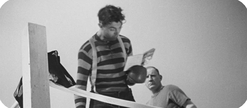
It’s common consensus that Soigne ton gauche is the best of the three 30s shorts to star Jacques Tati, a consensus with which I’m inclined to agree. And while it gives strong indications that Tati was growing as a writer and a screen performer, an equally critical factor in its success is René Clément, one of his only comedies and earliest efforts as director here but a competent and accomplished work nonetheless. Clément favours a rapid, highly dynamic pace through highly varied and dynamic camera angles, energetic camera movements, occasional undercranking, and rapid edits. This last point — at once the most accomplished stylistic trait of the film and perhaps its most misguided — makes itself clear as soon as the short opens: a postman cycles along the country paths and roads of rural France, zipping around corners, signaling though there’s not a soul in sight, and finally stopping in the village by simply tumbling forward off his still-moving bike. That stunt itself uses a jump cut just before the fall; it’s a rare instance in a Tati-starring film of an edit that allows a physical performance to cheat, but it works anyway, largely because the quick pace of the cuts already feels stylistically in line with the film and serves the slightly panicky, physically chaotic entrance. “Must be the postman!” exclaims a man who hears the crash but does not see it, and the postman delivers a letter to a group of men reclining by a boxing ring.
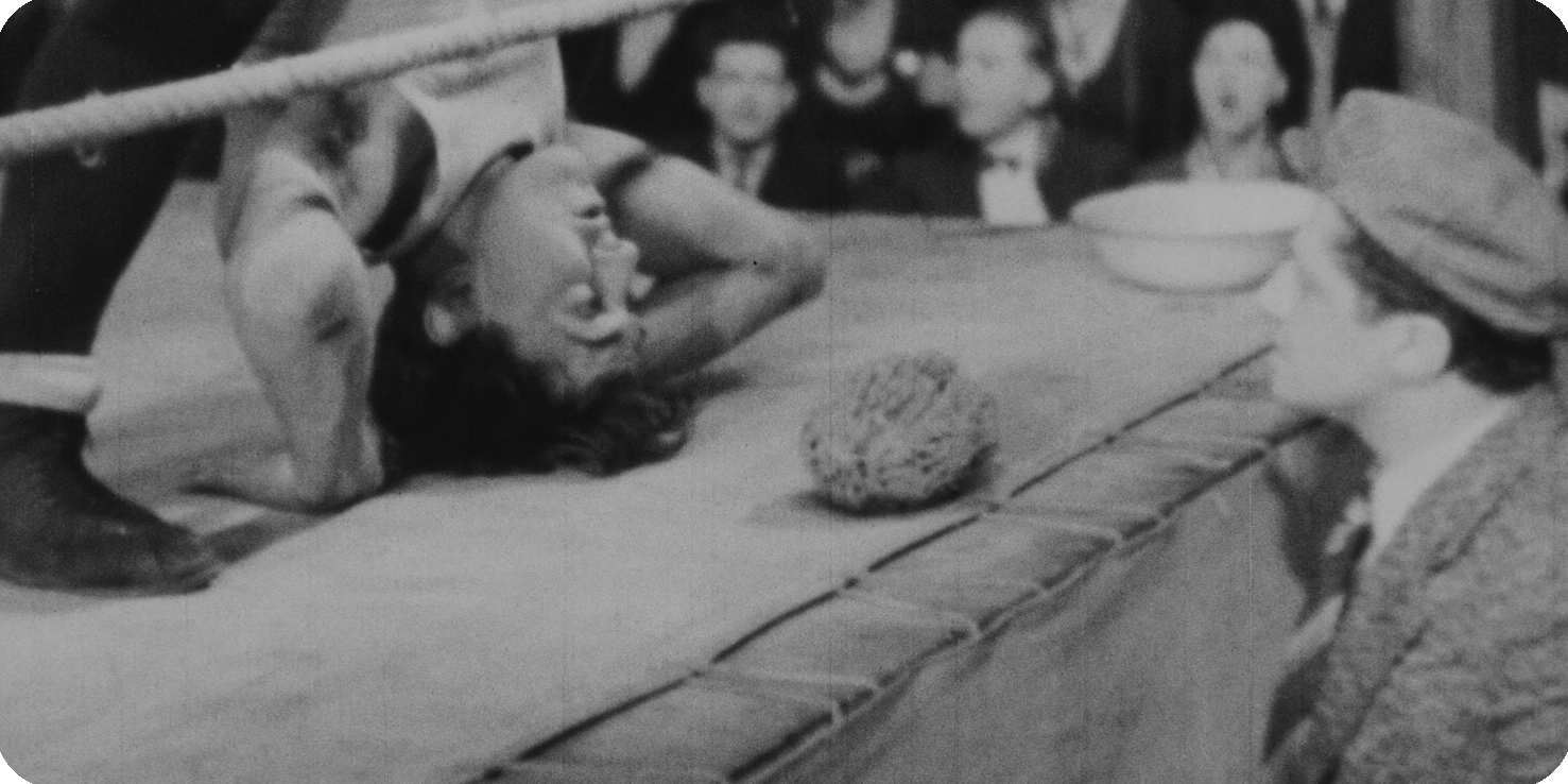
This sets up a plot similar to On demande un brute. One of the men is a star boxer, the rest help him to train, and the letter is insisting that they continue to train, as there’s a big crowd booked for their next match. They set out to training, but he’s a little too good: he knocks out his sparring partners straightaway. His manager quickly finds him a local farmhand named Roger — our Tati — who agrees, though he’s never boxed a day in his life.
This is drastically different from the tense setups of On demande un brute and Gai dimanche!, both of which involved characters forced into their actions by financial stress. Roger enters the bout willingly and knowingly. But why? Like those past films (and his future ones!), Tati plays a man unafraid to play, to imagine, to pretend. We first meet him playing with local children pretending to be a famous track star and they play the media, performing mock news reports and even pretending to film with a handmade toy camera, complete with a crank. Roger’s post-victory is cut short when he is called to work moving bales of hay near the boxing ring, where he quickly gets bored and mimes at boxing himself when he’s spotted and asked to spar. So here we have a dreamer, someone who wants to see what it means to live as other people do, and who gets his chance. He accepts not in spite of the physical danger and reality, but because of it.
But reality and imagination prove at odds with each other. As he fights, Roger looks through a little booklet of boxing advice in the ring, and every time he adopts a technique, he takes a punch, turns around, and looks through for more techniques. It’s a gag repeated again and again — with only slight variation — and while it gradually wears thin (save a lovely twist where Roger mistakes a back cover advertisement for a fencing booklet for advice on a boxing stance), it’s given more attention than any other gag in the movie, and so must have been especially attractive to Tati. Perhaps it’s because every variation is a chance for a new pose, a new bit of physical comedy for the performer whose miming act “Sporting Impressions” was in the process of making him a music-hall star across Europe. But it may also have been a moment of recognition for Tati of one of his pet themes, that of the outsider trying to understand the proper way to emulate a social behaviour and inevitably failing and watching chaos ensue around him.
And so chaos does, for after the pro boxer unknowingly connects one of his punches to the postman, the latter stomps off to find people to help him retaliate, and finds two tough-looking farmers who don’t take kindly to people who attack helpless postmen. Soon five men are in a fistfight on the ring, whose cheap structure gives way and leaves them finishing the fight in a broken down shambles of a wooden frame.
While the cutting is at times a little too brisk for the leisurely pace of the plot and the truly graceful acting that Tati delivers, the short is well-crafted and offers a coherent artistic vision. Tati-esque touches abound in general. We may easily mistake the overeager postman for Francoise, the subject of Tati’s L'École des facteurs and Jour de fête; likewise, Roger resembles a slightly more sullen Hulot, curious, befuddled, and entirely good-natured. Unlike the earlier shorts, both of which used faster pace musical scores to create a frantic soundscape, Jean Yatove’s for Soigne is mostly more relaxed. Rather than a driving underscore, the soundtrack’s jovial, fair-like atmosphere is more in line with Tati’s eventual musical modus operandi, even if it seems likely Tati had no direct hand in influencing it. Consistent with that convivial tone, there is no villain here: Roger’s opponent is patient, indulgent, friendly even, and the brawl that destroys the ring is instigated by an accident. And like the Royal Garden restaurant in Playtime, when it collapses, it becomes an entirely new structure that is now better suited to Tati’s character than those around him, and he quickly claims a KO and a decisive victory. While the satirical import and mind boggling complexity of that late masterwork certainly aren’t present here, one can leave Soigne ton gauche with a far better-formed impression of the artist than Une brute or Gai dimanche!. The final image, more than any one moment before it, bears Tati’s unmistakable signature in its wistful ode to the imagination: a wide shot of the kid with the toy camera as he rushes to film the postman cycling away down a long road.
Other Essays in This Series
On demande une brute
Gai dimanche
Soigne ton gauche
On the unknown self in "Asako I & II" (2018)
In romance stories every happy ending is the same, and every tragic finale is different. If there is a space between, it’s maddeningly difficult to define in anything but contradictory terms: if love does not end happily, how can it avoid some trace of tragedy? But how many of our own personal stories of romances cannot be cleanly sifted into one box or another, but are instead held in our memory in a slow, wobbling uncertainty, for months or years or decades before we can finally pack them away and assume they’ll never come open again? And who doesn’t on some level fear the re-emergence of some past romantic episode?

by Willa Ross
This piece references plot details indiscriminately.
In romance stories every happy ending is the same, and every tragic finale is different. If there is a space between, it’s maddeningly difficult to define in anything but contradictory terms: if love does not end happily, how can it avoid some trace of tragedy? But how many of our own personal stories of romances cannot be cleanly sifted into one box or another, but are instead held in our memory in a slow, wobbling uncertainty, for months or years or decades before we can finally pack them away and assume they’ll never come open again? And who doesn’t on some level fear the re-emergence of some past romantic episode? More than anything, Asako I & II, is about these fears, a treatment of their simmering, unacknowledged presence in our lives that ends with a terrifying affirmation of a notion famously expressed by Faulkner: "The past isn't dead; it isn't even past."
A romance film in the arthouse tradition, that is, one about obsession and doubles and finally an acceptance of one’s own long-denied perversity, Asako I & II may resemble familiar works in some ways, but it is, at long last, too tragic not to stand alone. After a few months of a reckless, love-at-first-sight relationship, the stone-faced, beautiful, and dangerously carefree Baku goes out to buy shoes and never returns to his lover, the meek and distantly sweet Asako. Years later, she meets Baku’s doppelganger, Ryohei, and soon falls into a long and loving relationship with him without ever mentioning his uncanny resemblance to her former lover. As the years pass by, the two clearly forge a more complex and communicative bond with each other than what Asako ever had with Baku; the outgoing, emotional, cautious and slightly needy Ryohei is pointedly sketched as Baku’s inverse. Then tremors of uncertainty emerge when Baku is suddenly reintroduced into the outskirts of her life: he’s become a celebrity through a career in modeling and acting. Asako can no longer ignore him.
That description forms the vast majority of plot, but the events are not linked through any traditional cause-and-effect construction. Explanations for characters’ decisions or outcomes cannot be decisively proven, only plurally hypothesized. Ultimately, we judge these people because we cannot understand them. We are called on to observe them with empathy, but Ryūsuke Hamaguchi’s direction and his co-written script studiously avoid tidy conclusions. This is a script dedicated to suggestion and possibility, and so its tone is rife with uncertainty and melancholy.
The aim is not to psychologize characters by slowly unveiling the full breadth and depth of their inner lives. Such an approach would in fact be antithetical to its core thesis. Instead, it advances a disturbing implication that a person who is ignorant of their own thoughts and desires is not necessarily ignorant, but that in the absence of certainty they have to work off a best guess. That is, the choice is to live forever with the destabilizing forces of trauma and loss, or to choose to tell one’s self a story that offers the best hope for moving forward, with “truth” as a faint and ephemeral Macguffin. Point of view shots, the most direct evocation of subjectivity and selfhood here, do not clarify feelings and identities; instead they render the thoughts behind their gazes disjunctive and ambiguous. One scene has a group of strangers insisting that Asako — whose perspective the frame assumes for a moment — eat an oyster for the first time. When she tries it, she quickly puts her hand to her mouth, seemingly revolted or even sick, and after a long moment she pulls her hand away, smiles, and says “It’s good!” Is she merely saving face? Is she lying to herself and them? Whatever the answer is, stepping into her shoes via the camera brings us no closer to it.
Above all else, Asako I & II is about the impossibility of yoking Identity to experience, and the scenario tests this premise in different variations and combinations. Most obviously there are the doppelgangers and the divided inner self of Asako herself (the English title probably doesn't go far enough in merely suggesting duality). But other echoes, reflections, and imperfect impressions of characters' interiority make this not merely an intellectual exercise but a mysterious experience. Asako's close friend Maya, an actor at the outset of her career when we first see her, is particularly memorable as a character who doesn't merely yearn to be with someone else, but to be someone else; most obviously she wants to perform as other people on stage and television. But it’s strongly hinted that she is also in love with Ryohei, and rather than competing for him she contents herself by vicariously enjoying his unflagging adoration for Asako.
The film is at once committed to suggesting psychological spaces by elliding them, and to maintaining a focus on interiority at all cost. Even acts of nature are blatantly symbolic: the 2011 Tohoku Earthquake is almost entirely severed from its sociopolitical consequences or even much of a procedural look at how people on the ground reacted to it. Instead, like the fireworks that explode in the moment she first locks eyes with Baku, it signals a violent rupture more for an individual than a wider population, and marks an uncanny shift in Asako’s attitude and choices. Whether this is meant to portray a world whose whims of chance and coincidence determine people’s lives, an outward expression of inward states, or both, is left somewhat frustratingly unclear, not to mention confusingly inconsistent: the most perilous moment for Asako, a motorcycle crash that occurs offscreen moments before we see her and Baku splayed across the pavement unharmed, arrives with no corresponding moment of inward change, and is simply used to illustrate her naive willingness to put her life — emotionally and physically — in the hands of someone who seems bound to destroy it. Like the earthquake, it’s a powerful moment taken on its own. But it’s also part of a wider approach to symbolism which (far more than its unwillingness to explain or diagnose its characters) sometimes renders Asako’s storytelling too diffuse for its own good.
Water is the most frequently summoned of these symbols, in rain, rivers, kitchen sinks, and elsewhere. It recurs so often that its significance demands attention (in the full sense of “demands”). Characters expose themselves to it, shield themselves and others from it, yearn for what (or who) is in the rain, settle for a life safely sheltered from it. When Asako and Ryohei move back to Osaka, where the obsession with Baku began and — for a few years — seemed to be buried, the impending disaster is underscored by a river next to their new home that runs so high a flood seems inevitable.
And it is. When Baku returns, it's so sudden and brazen that the gentle rhythm of life Asako has built with Ryohei and her friends is ruptured with a hallucinatory suddenness. The results are an apocalyptic realization of everyone's worst fears: Asako runs off with Baku, tells Maya (devastated more than anything by Ryohei's despondence) that she will never come back, and throws her cell phone out the window of Baku's car. He seems to feel neither here nor there about it. They seem to be driving into nowhere. Asako balks at the emptiness of her lover and her future; she goes back to Osaka and begs Ryohei to forgive and trust her. He eventually offers the former, but forever precludes the latter.
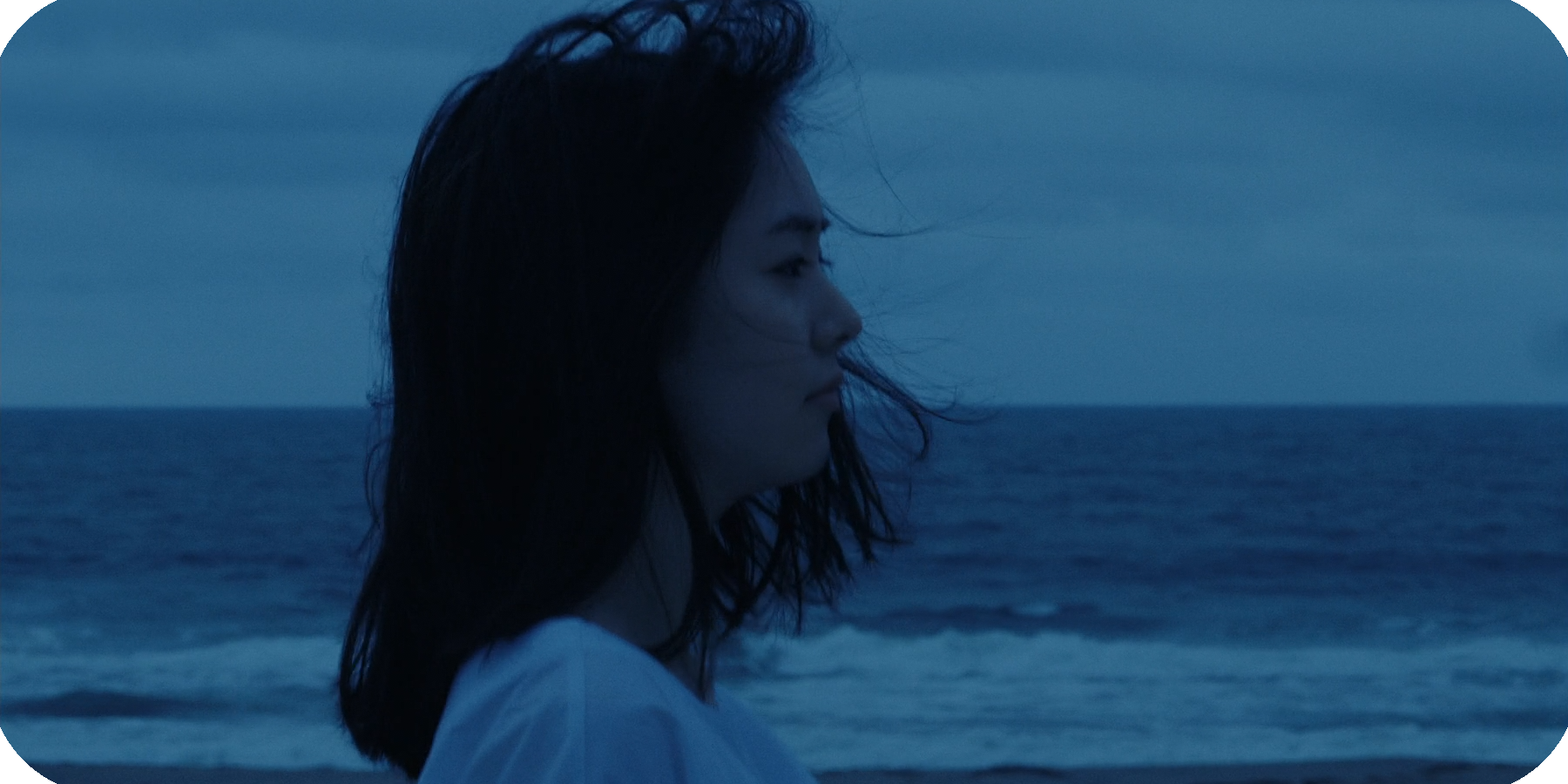
These final scenes are the film's only serious misstep, ending on a belaboured attempt at ambiguity and an on-the-nose recitation of water's symbolic significance (with Ryohei disgusted by a river's underlying uncleanliness, and Asako entranced by its aesthetic beauty). In truth, the trajectory of these people is too far down past too many points of no return to imagine their relationship as anything but an unhealthy one, and the attempt to tease out hopes to the contrary offer little to persuade otherwise. With the over-elaborated plotting and symbolism of the last 15 minutes, Asako I & II writes itself into a corner, but it's a corner that never really needed to be there in the first place. Just before this epilogue comes a moment that renders all that follows redundant with its totalizing immensity: Asako and Baku stop the car on a long, faceless stretch of highway, effectively walled in by concrete embankments shielding it against the sea. "You can't even hear the waves," Baku remarks, and it's true; this is the one moment when the sound design's ambience becomes uncanny, when we cannot resolve our intellectual understanding of the space with our visceral reception of it. In this moment Asako sends Baku on without her, and after he drives away, she climbs the embankment to face the vast water. Once more, a POV shot filled with the merged grayness of sky and water raises more uncertainty than clarity, but now the oceanic confusion is at last confronted head-on. Everything that follows over-enunciates what we learn in this moment: there are no easy answers as to where that confrontation leads, or the right way to handle it. Avoiding it may be the most monstrous choice of all.
Notes on Tati: Gai dimanche (1935)
While On demande une brute is by any standard a thoroughly clumsy work that neither conforms clearly to Tati’s pre-filmic mime act nor the tastes and interests he would come to display as the world’s pre-eminent master of cinematic high comedy, Gai dimanche is both an unmistakably formative work and a far greater success. The setup foregrounds the modus operandi that came to define Tati’s approach: breakdowns of human behaviour across class that show up the absurdity of social programming and how it pervades spaces of work and of leisure.

by Willa Ross
In Jacques Tati: His Life and Art (Panther), David Bellos mentions an anecdote in which Tati would claim the early shorts he wrote and performed in were funded entirely through his work in music-hall performances. As Tati told it, he would save some money, buy a few meters of unexposed film, and repeat the process. Bellos points out that his early shorts were either too expensive to entirely jibe with this shoestring funding story or made before he had any music-hall income to speak of. Given that these early shorts were such collaborative efforts (with directors, co-writers, producers, etc. working in what seems to have been a horizontal production structure), perhaps they represented a pooling of resources that had each party dredging up cash in their own ways, and one of Tati’s tasks was to purchase the footage. Whatever the truth of the matter, the anecdote stresses that these shorts were not cynical or merely desperate attempts to escape the challenge of making a living as a live performer in depression-era France; by all appearances they seem to have been labours of love.
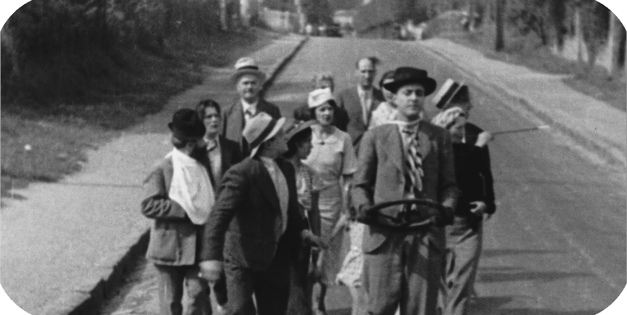
While On demande une brute is by any standard a thoroughly clumsy work that neither conforms clearly to Tati’s pre-filmic mime act nor the tastes and interests he would come to display as the world’s pre-eminent master of cinematic high comedy, Gai dimanche is both an unmistakably formative work and a far greater success. The short centers on two homeless grifters who one day decide they’d like a day in the country, and set about to realize it by stealing a rickety 10-seater charabanc and charging tourists for a leisure tour, complete with meal and entertainment. The setup foregrounds the modus operandi that came to define Tati’s approach: breakdowns of human behaviour across class that show up the absurdity of social programming and how it pervades spaces of work and of leisure.
In an early scene, as the pair of con men search a car lot for a workable ride, one nearby jalopy seems to start up all its own; when they open the lid, they find a kid in the empty compartment, blowing against his lips and making believe that he’s an engine as he holds a steering wheel in front of him. They wordlessly close the lid and leave him alone. While the gag isn’t especially complex or surprising, its use of sound without a clear originating source — what Michel Chion called “acousmatic sound” — foreshadows Tati’s obsessive play with the source, perspective, and audience assumptions attached to sounds in his films, and the way that our expectations of sounds play into our instilled sense of proper behaviour. The reaction is equally telling: as we’ll see time and time again in his Hulot films, the typical reaction of onlookers to an outsider’s well-meaning transgressions is to ignore it. That reaction is often more absurd than anything done by the unwitting interloper, and it’s there that Tati finds the core of his humour, both in its famously gentle observation of foibles and its acclaimed satiric intelligence.
That gag, while formally interesting, is nonetheless slight; mildly clever but lacking in elaboration or depth. Much the same can be said for the rest of Gai Dimanche, whose best gags either have a ring of familiarity from silent comedies by Sennett, Chaplin, Keaton, and others, or from their development into far superior forms in Tati’s features. Indeed, while his personality is on clearer display, it wouldn’t be a stretch to say that Tati is less impressive than his co-star and co-writer (and close friend), Rhum. The scarce dialogue given to Tati is delivered with a positively leaden lack of energy, and while his physical performance once again shows the clear skills of a uniquely talented mime (particularly in a sequence where the two con artists make a spirited attempt to attract customers to their tour, then gradually deflate into dejection when nobody shows interest), Rhum is his near equal that regard, and his skill with rat-a-tat verbal delivery make him the de facto star of the short.
After the disastrous excursion plays out in scenarios both funny (a passenger’s legs breaking through his seat, forcing him to jog along the pavement as the charabanc drives on) and unfunny (a large woman has trouble getting up into her seat), the final gag shows Gai dimanche’s most Tati-esque side as well as its still-unformed comic voice: after a train obliterates the charabanc, the drivers and passengers walk back to the city on the road in the exact same formation as before, with Rhum pointing to the side and guiding the sightseeing tour as Tati grasps the detached steering wheel in front of him. It’s an amusing-enough articulation of people’s desire for routine and normalcy, and the paradoxically absurd results of that attitude. At the same time, the complete lack of indignation from even the most well-to-do of Tati’s and Rhum’s customers feels unconvincing. Tati would eventually recognize the resistance people tend to have to paradigm-shattering playfulness and endow it with a sense of pathos that elevated his Hulot comedies from amusements to masterpieces, but the partial gestation of his worldview visible here — especially when assisted by competent direction and far more involved sound design — makes for a fun Sunday viewing.
Other Essays in This Series
On demande une brute
Gai dimanche
Soigne ton gauche
Shot Analysis: The Matrix (1998)
My favourite shot in The Matrix doesn’t have quite the same glitzy showiness as so many of the movie’s other high points, and I hope I can be forgiven for declaring a self-consciously arty and moody moment as the visual peak of a film that raised the bar for accessible pop moviemaking with its photographic bombast. But my favourite it is, and I’d like to deconstruct it to explain why.

by Willa Ross
To date, the original Matrix film is arguably the summit of both Bill Pope and the Wachowski sisters’ careers as imageists. The film’s camera direction, lighting, and compositions brim with the best kind of pop-cinema inspiration, with even the most modest sequences offering much to admire. The film is packed with justly iconic moments — Morpheus’s sunglasses, Trinity breaking the glass (and implicitly the fourth wall), the moment when Neo plucks a floating bullet out of the air, among countless others — whose craft could easily merit their own post. My favourite shot in The Matrix doesn’t have quite the same glitzy showiness as so many of the movie’s other high points; I hope I can be forgiven for declaring a self-consciously arty and moody moment as the visual peak of a film that raised the bar for accessible pop moviemaking with its photographic bombast. But my favourite it is, and I’d like to deconstruct it to explain why.
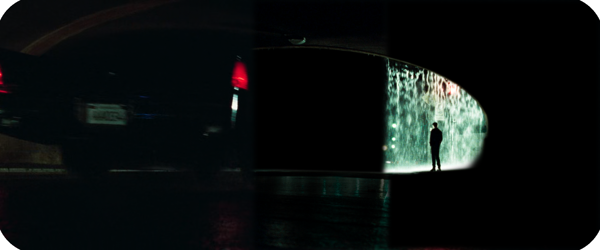
Let’s run down the necessary dramatic context: Neo — who hasn’t yet been awakened from his simulated existence in a matrix designed to mollify all humanity while machines suck their juices out for battery power — is waiting for his contact, known only as Trinity. Neo internally understands that the world he lives in is somehow not the world as it really is or ought to be, that he does not fit, that he desperately wants answers but doesn’t know his own questions. So he waits at the agreed upon place, under an overpass, watching the pouring rain.
The shot makes clever use of several compartmentalized elements in order to achieve a complex expression of that dramatic situation within a simple frame. Let’s first consider the composition. The shot is a clear example of a frame within a frame, with Neo situated within a semi-circular arch in front of the wall of rain. Yet the image is even more sophisticated than that: not only does the frame-within-a-frame of Neo in the arch function coherently as its own separate image, the material surrounding Neo would survive the removal of that semi-circle. Here are visual examples to illustrate what I mean:
The “Tunnel” shot works as a spare, simple frame. Its concrete textures and soft, minimal lighting creates a sense of inevitability, foreboding, and tightly constructed oppression. The “Rain” image is much more emotionally tumultuous and personal, connecting a human silhouette to a complex textural experience (the water) that cannot be described in simple geometry. The falling water furthermore suggests a vast and oceanic internal state, and its bold blue-green colouration — along with the hints of red scattered throughout — contribute to its evocation of a subjective state. Only the reflections on the ground connect the two images (I’ve darkened them above to better illustrate my point), which are otherwise discrete and easily readable in and of themselves. The shot’s multi-layered construction invites us to consider it in part as two separate competing images. Such an approach yields narratively appropriate results: the oppressive, precise geometric image represents the world of the machines, which, from the shadows, encloses and subtly controls the emotional world of the humans represented by the inner frame.
We can further observe the overall shot’s lack of discernible depth — the walls of the tunnel are too indistinct to evoke distance, and the sheets of rain pouring off the walls of the overpass form a “wall” directly in front of Neo that prevents him from being able to “see” farther than himself. There is therefore a sense of immobility, of being “trapped” within a broader structure that cannot be seen or articulated, as well as a sense that the inner and outer image are inseparable, albeit distinct. It’s a rich metaphorical statement of Neo’s place in the world at the beginning of the film, but the final touch that makes it my favourite is yet to come.
Trinity’s car, its tail lights glowing red, violates the perfectly balanced ecosystem of the frame from the extreme foreground, violates the flattened z-axis, violates the hermetic and colourless space of the tunnel. It provides the means of escape for Neo, like a 2D character being introduced to the concept of 3D movement for the first time. It effectively revolutionizes the status quo of the frame.
How elegant is that? A single frame, its logic carefully worked out in each element of colour, light, and composition to describe one state, and then those elements thrown completely out of order by an invading element that reconfigures that state and throws the situation into tension. It’s an excellent example of how cinema can formally recontextualize itself in clever ways, wordlessly evoking a world of ideas in just a single four-second shot.
A Monument to Death: The mad melancholy of Ed Wood's "Bride of the Monster" (1955)
This is the first and most expensive film in Wood's legendary Kelton Trilogy, and in many ways it shows: sets frequently resemble the locations they aim to represent, camera movements are fairly regular occurrences, and the lighting is more elaborate and attractive than anything seen in Plan 9 from Outer Space or Night of the Ghouls. What's more, while the film's construction is shabby by any typical Hollywood standard of craft, this provides more genuine technical showmanship than any other Wood movie I've seen, with ambitious and well-motivated movements, expressive blocking, and a daring willingness to slow the pace down — and yes, it’s on purpose.

by Willa Ross
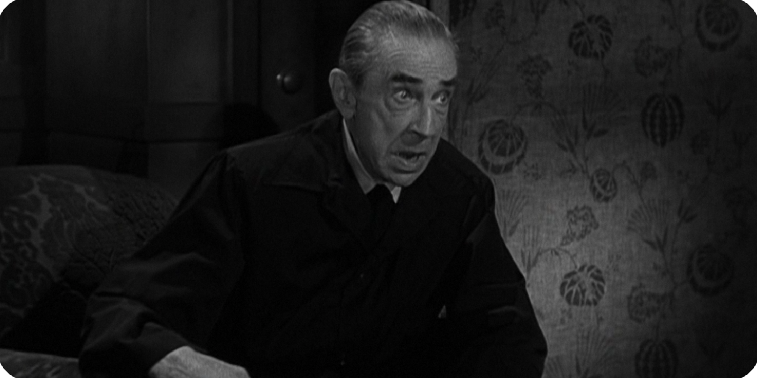
Following Glen or Glenda and Jail Bait, Ed Wood somehow managed to get his hands on a budget more than triple that of his first two films, and used it to make his most overtly melancholic picture, a riff on the Universal Frankenstein films that starred Boris Karloff. As the second (and most substantial) collaboration between Wood and Bela Lugosi, this film gives the old horror star a role as Dr. Eric Vornoff, a long-banished scientific genius of some European power, who has committed himself to using atomic energy to create superhuman soldiers and revenge himself upon a world that jeered him and took his home away.
This is the first and most expensive film in Wood's legendary Kelton Trilogy, and in many ways it shows: sets frequently resemble the locations they aim to represent, camera movements are fairly regular occurrences, and the lighting is more elaborate and attractive than anything seen in Plan 9 from Outer Space or Night of the Ghouls. What's more, while the film's construction is shabby by any typical Hollywood standard of craft, this provides more genuine technical showmanship than any other Wood movie I've seen, with ambitious and well-motivated movements, expressive blocking, and a daring willingness to slow the pace down — and yes, it’s on purpose.
It is also, by far, the most melancholic Ed Wood movie I've seen — and the Kelton Trilogy does not lack for melancholy. Vornoff is, unequivocally, a villain — delighting in siccing his giant octopus(!) on people, beating his mute, mentally disabled assistant Lobo (who is heavily implied to be the result of a failed experiment), and lamenting the death of his home and the ruin of his name. Twice he ruminates that his name is little-recognized; the erasure of his existence and his gift weigh heavily on him. Meanwhile, a very low-stakes feeling main plot draws a newspaper reporter and her police lieutenant fiance into their own respective investigations of Vornoff and the rumours of a giant monster killing people in the swamp.
All this is peppered with just enough Wood-ian moments to make it an enjoyable viewing experience; sometimes those moments are risible, and sometimes reaches for and achieves a true poetry, as in one scene where two police officers reflect on the swamp that serves as the center of the story, and as they speak Wood cuts to a lengthy lateral tracking shot that slinks across a river as the trees on the far shore slide past. "This swamp is a monument to death," Craig says, and for a moment a true sense of mortal anxiety palpably emerges.
It all seems to be a slightly battier progression from Jail Bait's mostly-conventional plotting and presentation, and therefore primed for placement among Wood's minor work. Then Lobo knocks out Vornoff, places him on his own operating table, and the film goes absolutely nuts, escalating until its explosively discordant ending.
There are more than a few resemblances between this film and Kiss Me Deadly, a film released only a week after this one, which similarly deconstructed and criticized its genre before an ending that explodes the film's structure itself with a nuclear flash. Bride takes this atomic explosion even further — both in terms of its rapid narrative deterioration and by the depiction of an actual nuclear test footage when Vornoff and the octopus are inexplicably destroyed by lightning. The doctor is, at last, disintegrated, not only his name but every atom of his body cast into the fire.
In this sense, the film is Wood's most direct and successful allegory for the threat of nuclear weapons, a threat that churns reason into madness and whose logical endpoint is illogical destruction. Plan 9, of course, would deal with similar themes, but takes inter-cultural paranoia as more of an interest than nuclear devastation. It may not have the scene-for-scene bombast of Wood's other great works, but it trades that for his only honest-to-god big-picture structural setup and payoff, one that renders the ending all the more astonishing and confusing and entertaining by its relative meekness in advance. That makes it a perfect introduction to Ed Wood, whose internal sense of poetry will not be shackled by the strictures of conventional "quality" filmmaking.
"He tampered in God's domain," intones the old police chief as he and the film's other stars watch the mushroom cloud. As a caution against overreaching science, it's not especially convincing — after all, this guy had no way of even knowing about Vornoff's experiments. But take the other possible meaning of that phrase, and it becomes apropos, even poignant. Wood, an avowed cross-dresser and artist who was punished again and again just for who he was, must have felt acutely for the man who was destroyed for having a unique mind. It wasn't for challenging the rights of God to create life that Vornoff was shunned and finally annihilated; it was trying to rise above the circumstances of his fortune-blighted existence that earned him his cosmic judgment.
Notes on Tati: On demande un brute (1934)
As the oldest surviving film to feature Jacques Tati, this provides an interesting ground zero for his talents, even if it's a pretty lousy cast-off of a comedy. Here, Tati co-wrote with Alfred Sauvy this short about a young, lanky actor named Roustabat, who has trouble getting cast, and whose domestic partner is constantly insulting him and his vocation. Meanwhile, a low-level fight organizer is having trouble booking an opponent for a wrestling match he's already sold out (nobody wants to fight his infamously brutish star fighter), and so he publishes in the newspaper a vague call for men "specializing in violent roles". You can probably fill in most of the blanks from there.

by Willa Ross
As the oldest surviving film to feature Jacques Tati, this provides an interesting ground zero for his talents, even if it's a pretty lousy cast-off of a comedy. Here, Tati co-wrote with Alfred Sauvy this short about a young, lanky actor named Roustabat, who has trouble getting cast, and whose domestic partner is constantly insulting him and his vocation. Meanwhile, a low-level fight organizer is having trouble booking an opponent for a wrestling match he's already sold out (nobody wants to fight his infamously brutish star fighter), and so he publishes in the newspaper a vague call for men "specializing in violent roles". You can probably fill in most of the blanks from there.
This makes direct show of Tati’s love of silent comedy — most obviously, in the fight sequence, Chaplin and his City Lights — but unlike his features that evolved a more open-ended structure to scenes, each vignette here takes on a clear comic premise by way of a sitcom-y point of tension. The use of sound is also not especially crucial to anything in the movie. In fact with the dialogue removed and a few intertitles added, On demande une brute would work as a silent. In some ways, it might even be better off in such a form: the music, a first-time score by Marcel Landowski, frequently competes with the dialogue, and heavily punches up most of the slapstick gags, leaving hardly any work to be done by sound effects.
On the other hand, one of the most effective moments of the film comes when short, pathetic little crunch as the scene fades out. It’s a very Tati-esque use of sound by the director Charles Barrois, and one wishes he displayed the same light touch and attention to the most effective points of comic focus throughout the film. Sadly, he often drops the ball in this respect; not only are many of the cuts to reverse shots and close ups awkward and disorienting, but Barrois will frequently miss major opportunities for laughs. For example, just before the fight, as the announcer is still addressing the audience, someone accidentally hits the gong, and Roustabat’s opponent mindlessly charges the poor man in the middle of the ring, leading to a moment of chaos where several men have to pull it off. It’s a perfect moment to indulge in a closeup of Tati’s worried face as the punchline, but that fairly clear chance for a payoff never comes. Not that Barrois’s work has nothing to recommend it. Now and then a shot or series of cuts will show an interesting sense of staging or strangeness (as when Roustabat is hung upside down near the end of the ring and sees a face next to his ringside, and a series of cuts flip quickly between his POV and a right-side-up view of the man). But in the main it’s a visually disinterested, burdensome comedy, both stylistically anonymous and quite poor at emphasizing comedy.
I don’t want to give the impression here that Barrois fails because he fails to highlight Tati’s great performing ability, since Tati’s performance itself here is, shockingly, kind of lousy. While he shows some of the precise control over his body that would make him one of the most graceful physical actors there ever was, his sense of how to exploit little changes to the angles of his limbs, affect an entire personality in his gait or lean or cock of the head, or use tiny changes of facial expression to worldlessly communicate a universe of inner thoughts... well, that sense simply isn’t visible here. Instead, it’s a performance with a fairly game willingness to emphasize Tati’s stick-like figure and a lot — a shocking amount, really! — of mugging.
After Roustabat upsets the fight and wins (by cheating), he, his friend Mérandol (who smashed the other fighter’s head with a lead pipe), and his now-admiring wife head to a car outside. After the three disappear behind the vehicle, it drives off and leaves his formerly-nagging wife behind. It’s a surprisingly mean-spirited ending for the future auteur whose own films would only gently mock the vices and pretensions of others. It may be one of the best-staged gags in the movie, but that ought to lend you a sense of how low the bar is set here. It’s a mostly good-natured and well-intentioned film (short of the caustic depiction of its only female character and a scene that makes rather cruel use of a live fish). That it was made by a combination of upstart professionals and rank amateurs to film (the latter category including Tati himself) accounts for its issues, though when viewed an early attempt for the destitute-at-the-time Tati to break from the music-hall into motion pictures, there are hints of his future output’s ethos, in particular a sympathy for the dim, hapless, and incurably uncivilized but thoroughly well-meaning outsider.
Other Essays in This Series
On demande une brute
Gai dimanche
Soigne ton gauche
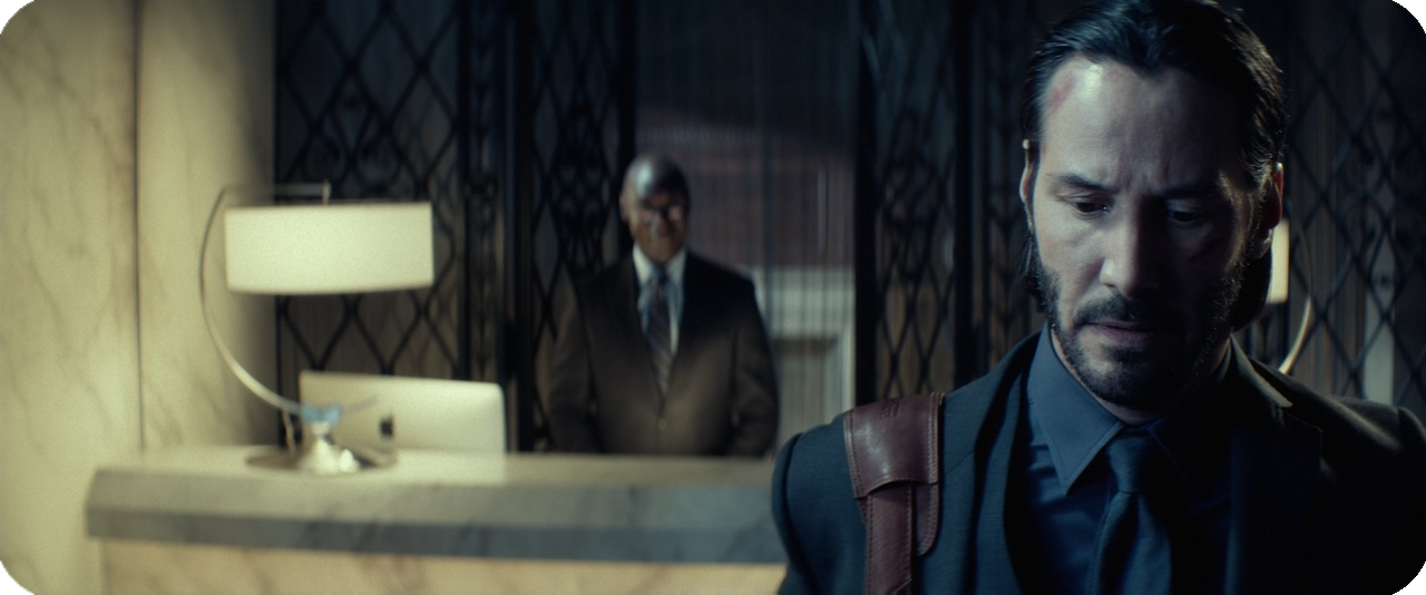
Notes on John Wick: Chapter 3 (2019)
The particular brand of pop cinema that Stahelski and his team pull off here is something that you can’t find anywhere else, and in a way that makes John Wick: Chapter 3 – Parabellum one of the best modern action movies of its kind. That it is still a decidedly flawed movie may speak to the lack of great work being done in that sphere by Hollywood filmmakers, but it also shouldn’t deter appreciation by what it gets right.
by Willa Ross
Sure, you can make the case that the John Wick movies — his entire filmography to date — aren’t ideal uses of Chad Stahelski’s talent, but as far as the setup and execution of car chases, gunfights, knife fights, and kung fu battles, I don’t think there’s many ways to fault him for lacking competence or creativity. The particular brand of pop cinema that Stahelski and his team pull off here is something that you can’t find anywhere else, and in a way that makes John Wick: Chapter 3 – Parabellum one of the best modern action movies of its kind. That it is still a decidedly flawed movie may speak to the lack of great work being done in that sphere by Hollywood filmmakers, but it also shouldn’t deter appreciation by what it gets right, and what it gets so, so right is its ability to economically introduce interesting fight scenarios and then capitalize on them with panache.
The plot reconfigures the rules and stakes from the last chapter, but still feels very much of a formula: Reeves is back as John Wick, the former assassin who took revenge on a low-level mobster for killing the puppy his wife had delivered to him just after her death, setting off a chain of resentment and attempts of payback all the way up to the “High Table”, a council of the most powerful criminals in the world who have a text message to every criminal in the world that they should kill John Wick, or at the very least not help him. Enforcing the will of that council is the “Adjudicator”, a brusquely direct emissary who informs those who have displeased the high table (usually by helping John Wick) that they have to accept punishment in the form of a bunch of scarring sword slices or having their hands stabbed or being fired. I’m not sure why she doesn’t just have them killed, which crime bosses tend to do to avoid having maimed or humiliated underlings turn against them, but I’m not gonna raise too much of a stink about a premise that is openly ridiculous in the first place. I wish the plot of these movies made more sense, but it rarely gets in the way of the action.
That’s similarly the biggest compliment you can pay to the music, which, to be 100% clear, is me damning it with faint praise. While Tyler Bates and Joel J. Richard once again avoid the overwhelmingly generic rock beats ‘n’ guitar chords of the first film by using a broader palette of electronic rhythms and ambiences, the music remains frustratingly limited in its development and tonal flexibility. The main theme in particular has received virtually no meaningful embellishment over the course of three movies now, which particularly stings given it was never a complex or especially expressive theme to begin with. One could argue that John Wick himself isn’t the most dynamic character, but that’s no excuse for this kind of musical inertia. It certainly doesn’t stop the film’s other craftspeople from trying new things elsewhere.
(A sidebar on a particularly annoying aspect of the score: The single most interesting musical decision in the film is the use of the first Winter movement from Vivaldi’s Four Seasons. Unlike the second film’s Vivaldi cue, which used a heavily electronic remix of the third Summer movement, the use of Winter I here is a straightforward orchestral performance of the original composition, which works terrifically well to create a chilled sense of foreboding. Confusingly though, rather than changing to an action-movie styled take on the movement or using the fast-paced third Winter movement, once the fighting starts the soundtrack reprises that same damn Summer electronic piece from Chapter 2, a nonsensical choice that once again foregrounds what an ineffective redo it was. Given that the credits feature a similar remix of Winter I, it seems like a safe assumption that Stahelski was unsatisfied with the new cue, opted to reuse the old piece, and stuck Bates’s and Richard’s take on “Winter” in the credits. I can’t entirely blame him, since the piece heard in the credits once again scuttles the rhythmic glories of Vivaldi’s piece and uses a dull electronic arrangement, but undercutting the continuity of the musical concept by using the reprise was at least as bad a choice, especially when it meant reusing a cue that wasn’t good to begin with.)
Just as Bates and Richards earn the same criticisms, every positive thing I said about Dan Laustsen’s cinematography in the last one applies here (though sadly this time Kevin Kavanaugh’s production design finds less opportunities for those ornate parodies of locations). Laustsen’s work in this series is a highlight of the 2010s’ neon revival, tremendously baroque with its placement of coloured lights and shadows and thoughtful in its scope framing, assisted by Stahelski’s marvelous gift for camera direction, which is more consistent here than ever, both in the loud and quiet parts. That goes for the loud parts especially though; the clearness of the staging belies the complexity and precision of the camerawork here. In particular, one sequence involving two gunfighters fighting alongside two dogs makes incredible use of the camera to establish the lateral space and track how quickly and efficiently the dogs can close that distance while keeping everyone’s position’s clear in any given moment. A John Wick movie could work with a lot of parts or personnel shuffled around, but it’s hard to imagine one this good without Stahelski and Laustsen behind it.
While John Wick mostly confined itself to superlative displays of driving and gun fu from Reeves and Chapter 2 added interest by setting up his limitations and making more extensive use of the fight settings, Chapter 3 blows elevates the series to new levels of complexity and invention. There are multiple action sequences in Parabellum that take unusual premises (fighting in a stable full of horses, fighting in a room full of antique bladed weapons behind glass, fighting goons who are so heavily armoured that the only way to actually kill them is by walking up, opening their helmets’ visors, and shooting into them) and explore every logical avenue imaginable and, most delightfully, many I didn’t imagine at all. One of the most relieving things about this is just how funny the action is, how almost every fight indulges over and over in those Buster Keaton-esque setups and payoffs, those logical extremes that shock you, but at the same time make complete sense for the characters and their situation. While the last two or three fight scenes lack this sense of humour on account of being standard melee combat, they are at least excellent melee combat, if a bit of an anti-climax (made all the more familiar by an obvious nod to the structure of Game of Death). The only real complaint I have is that the sound design, while mostly terrific, is a little overeager to make every impact a thooming, bone-crushing smash, which makes it hard to distinguish the big hits from the really big hits. You can’t go up from 10, as they say.
One way that Parabellum achieves such diverse action scenarios is by leaning harder into an episodic story structure than either of the Wicks before it. On one hand, this means that dramatic development is extremely minimal, as characters tend to show up, have their personal conflicts introduced, and then either be killed outright or be shown the door for potential reuse in a sequel. By traditional standards of feature film storytelling, this is a problem; here, though, quickly sketched, entertaining characters are entirely suited to economically setting up the conditions and stakes of the next big rumble. I don’t think I’d go so far as saying it’s a good script — the writing is mostly boilerplate as usual, the rules of the universe are still a bit arbitrary and inconsistent, and the material is primarily elevated by the cast’s more over-the-top performances and Stahelski’s direction — but Derek Kolstad has sanded off a lot of the issues that his scripts caused for the first two movies. This time around his most unforgivable sin is having Keanu Reeves deliver a weightless nostlagia-boom for fans of The Matrix by having him say, “Guns, lots of guns”. I mean come on, man. We’re all aware he was Neo.
After three movies of insanely brutal carnage, though, it probably behooves one to, uh, think about violence for a second. What, after all this, almost six hours of headshots and flipping people over and smashing vehicles, does it all mean? The easy (and filmmaker-intended) answer is “not a thing, it’s a cartoon, enjoy it,” but that feels a little too pat. I’ve seen reactions to John Wick: Chapter 3 that chastise it for indulging so gleefully in gun violence, but that feels too exclusionary towards the self-aware cartoonishness that the series has cultivated and improved from one entry to the next (and I do not have the patience to return to a debate about whether violent cartoons are “moral”). Maybe what squash and stretch physics do for the emphatic motion and chaos of Bugs Bunny, brain matter and broken bones do for the John Wick movies; mutual exaggerations of the physical effects of violence. Maybe laughing at most of a head disappearing under a shotgun blast is different than laughing at Wile E. Coyote turning into an accordion. Maybe one is more honest, maybe one desensitizes you less. Maybe it’s okay to have fun in a movie where horrible people who are caricatures of organized criminals in an absurdly implausible global gang hierarchy murder each other in creative ways. Yeah, that last one feels good. Let’s go with that.
Other Essays in This Series
John Wick
John Wick: Chapter 2
John Wick: Chapter 3 – Parabellum
Notes on John Wick: Chapter 2 (2017)
For Stahelski, the new comic point of reference isn’t quite a Looney Tunes cartoon, but Buster Keaton. One of the film’s opening shots focuses on a scene from Sherlock Jr. projected on the side of a Manhattan building. The in-your-face delivery of that influence to the audience reflects a very welcome post-modern playfulness with Chapter 2’s own identity. That identity, for what it’s worth, never successfully resolves, but Chapter 2 imperfectly points a potential path for an action movie whose split personality is half the fun.
By Willa Ross
If this was 2014 and I was allowed to offer one piece of advice to the makers of John Wick for their development of a sequel, it would be to adopt a greater commitment to tone. While that film played with some goofier material and sprinkled in some personal pathos and indulged in some heightened crime drama, its expression of each tended to feel like half-measures, rubber banded to an indistinct center whose emotional heft was murkier than the film’s needlessly low-contrast photography. The crime material offered up hammy line readings but ought to have pushed the juvenilia of its world-building up to the hilt, the mourning and reflection was given time to but rarely aimed for the melodramatic operatics that could make it proportionate to the action-crime-drama material and give it emotional credibility, and Wick’s unfathomable power to survive shootouts with any number of hired guns was given some wry nods, but a force so brutally unstoppable should be less like the Wachowskis’ Neo and more like Chuck Jones’s Road Runner.
For Chad Stahelski (this time directing solo), the new comic point of reference isn’t quite a Looney Tunes cartoon, but arguably the closest thing to it in live action cinema, Buster Keaton, a declaration I’m not making based on careful scrutiny of the film’s stylistic properties but based on the fact that one of the film’s opening shots focuses on a scene from Sherlock Jr. projected on the side of a Manhattan building. While it’s not a comparison that the film always strives for, the influence is felt and appreciated, and the in-your-face delivery of that influence to the audience also reflects a very welcome post-modern playfulness with its own identity. That identity, for what it’s worth, never successfully resolves, but Chapter 2 imperfectly points a potential path for an action movie whose split personality is half the fun.
The opening sequence — where Wick storms a garage serving as a front for the Russian mob — is better than anything in the original. First and foremost, you have Peter Stormare playing the brother of John Wick’s chief antagonist, and his bit part (confined to appearances in a single room in the first 15 minutes) is the best performance in either film. If Michael Nyqvist’s Russian crime boss was slyly parodic, Stormare’s is an abject mockery of the stereotype. Or maybe it’s just an abject mockery of “acting” as a “character” in a “movie”. Either way it’s absolutely hilarious, not just exploiting the humour of the lines as written but pouring excess all over them and singlehandedly breaking the illusion of a contiguous fiction. It’s more syrup than pancake, and I love it.
The opening also announces Chapter 2’s shift in focus in that it is completely irrelevant to the film’s plot. While there is a plot that threads the movie together and it is an entertaining plot, it’s also a lot of nonsense, and by opening with 15 minutes of wholly disconnected action rather than the studious character development of John Wick, Stahelski and returning scribe Derek Kolstad signal heavily that literary levels of dramatic structure are not the point of the plot. The point of the plot is to deliver inventive and well-staged action set pieces and moments that try to make you laugh as hard as Peter Stormare.
The plot, for what it’s worth, involves John continuing his fruitless quest to re-retire from the underworld. Instead he causes an extreme crescendo of pissing powerful criminals off, and gradually seems to accept that this is his life now, just headshotting people who try to kill you until you can get to antagonist du jour and killing him and enjoying a moment of respite before all the people who liked or worked with that antagonist tell everyone they know to kill you. It’s a formula that’s carried over from the first film and would feel stale if it weren’t for the fact that it rises to such crazy heights here; the fact that Wick gets himself into much deeper shit than turning the entire Camorra crime syndicate against him should give you a hint at how giddy this series is about turning almost literally the entire world against him.
That tidal wave of would-be killers translates to an enlarged body count, which means killing a whole lot more people on average in the handful of section pieces that give the movie reason to be. While John Wick’s action sequences derived their success almost entirely from Keanu Reeves’s ability to fluidly launch his body from one position to the next in reaction to his assailants — a quality retained and even enhanced here — Chapter 2 adds numerous elements to give each fight and shootout its own arc. That often entails greater interaction with the environment, as in a hall-of-mirrors sequence that confounds our sense of spatial orientation, or more diverse tactical decision-making, displayed up-front when Wick outfoxes his motorcycle-driving quarry in a car chase by swinging through a route with faster traffic before stopping his car dead in the middle of an intersection, right where the chopper can’t help but slam into the side and send its rider sailing into the concrete.
But the most important and effective way this Wick crafts more satisfying fight scenes is by incorporating a whole lot more table setting. John’s loadout before each fight is introduced in (sometimes laboured) detail, and those setups are paid off amply every time: in one fight his frustration at being given a single pistol with a seven-bullet magazine pays off multiple times as he angrily runs short of bullets, switches guns, throws the cast-offs at his opponents; in another, he removes a piece of kevlar shielding that was sewed into his jacket when he thinks a gunfight is over, only to desperately hold the floppy bullet-proof oval in front of him as he’s ambushed. It’s these logical (and usually comical) extrapolations from Wick’s toolkits, more than anything, that reveals the Keaton influence.
I also have to single out the film for its improvements in music and cinematography, two of the biggest problems with its prequel. While the music by Tyler Bates and new composer Joel J. Richard is only a marginal improvement from the last (thanks mostly to adopting a slightly expanded sonic palette), the cinematography, this time headed by Dan Laustsen, hasn’t just escaped liability; it’s now one of the film’s biggest assets. Laustsen retains the film’s love of colour splashes, ditches the blue and orange filters and low contrast of the last film (there are numerous scenes with neutral skin tones here), and displays a far greater utility with composition than Jonathan Sela’s work last time around. It’s not just a big step up from the cinematography in the last Wick movie I saw, but the last Dan Laustsen movie I saw: the fact that it was the sloppy visuals in The Shape of Water that gathered Laustsen all the accolades in 2017 while his work here received no attention is a prime example of how farcical the Hollywood awards season is. It also helps that the production design — with Kevin Kavanaugh heading that department this time — is lovely and well-tuned to the movie’s aesthetic and sense of humour, full of baroque parodies of the settings — museum, modern art installation, Italian hotel — that both help the film’s comical tone and give a more robust colour arrangement. It’s Kavanaugh’s best work to date, and a great example of a project that gives a production designer room to do something truly unique.
In fact, I could almost say that the improvement on offer here is nearly across-the-board. That doesn’t mean Chapter 2 is flawless, mind you. A little bit of the first film’s half-baked attempts at psychoanalyzing Wick rears its head from time to time (most irritatingly in an excruciating “I think you enjoy this” speech given by the bad guy as he hides around the corner”). There still isn’t much of a sense of palpably rising stakes and heightening tension over the full runtime. And a lot of the dialogue still feels very written, the attempt to be cool coming through much clearer than any actual sense of being cool. The music, while a bit better, is still wallpaper-y at its best and irrirating at its worth (as in a baffling remix of one of the Summer movements from Vivaldi’s Four Seasons that strips out almost all the rhythmic urgency). And finally, I’d be remiss if I said that as of this chapter this series is developing something of a problem with associating its few female characters with sexualized violence, particularly a scene where a character strips nude before slitting her wrists and lying face-up in a pool of water. I’m happy that Kolstad is pushing for more operatic levels of melodrama here, but scenes like that show a thoughtlessness about the approach that I dearly hope changes in Chapter 3, and make the overwhelmingly male crew a lot tougher to swallow.
That, ultimately, is the most telling compliment I can pay to John Wick: Chapter 2: it shows artists committed to improvement and confident enough to deliver an undeniably entertaining pop cinema experience. While I came into John Wick and Chapter 2 with a sense of obligation to stay in the loop about modern action movies, I’m actively excited to go see the new Parabellum chapter later this afternoon and find out what new ideas and improvements these artists have to offer. He may not be the Road Runner, but Wick is definitely starting to really step on the gas here.
Other Essays in This Series
John Wick
John Wick: Chapter 2
John Wick: Chapter 3 – Parabellum
Scene Analysis: Cinematography in GAME OF THRONES Season 8 Episode 5, "The Bells"
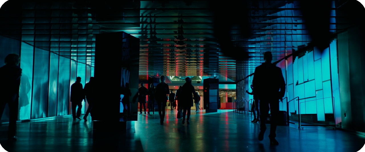
The cinematography in prestige TV shows has a long history of attracting superlatives like “visually stunning”, and to be frank, a lot of the time that claim is bunk. Still, it’s not healthy to dismiss praise like that out of hand every time without deeper thought, so sometimes I’ll test those claims by choosing a simple scene from a show that represents something like a dramatic median, watching it, and deconstructing it. Besides this being a healthy exercise for anyone who loves the cinema, it can yield surprising results that overturn first impressions. Today I thought I’d share that process and apply it to a scene from “The Bells”, the latest (and penultimate) episode of Game of Thrones, a series that has garnered praise from mainstream critics for its craft, even as those same critics have roundly turned against the writing in the last few episodes.
By Willa Ross
The cinematography in prestige TV shows has a long history of attracting superlatives like “visually stunning”, and to be frank, a lot of the time that claim is bunk. Still, it’s not healthy to dismiss praise like that out of hand every time without deeper thought, so sometimes I’ll test those claims by choosing a simple scene from a show that represents something like a dramatic median, watching it, and deconstructing it. Besides this being a healthy exercise for anyone who loves the cinema, it can yield surprising results that overturn first impressions. Today I thought I’d share that process and apply it to a scene from “The Bells”, the latest (and penultimate) episode of Game of Thrones, a series that has garnered praise from mainstream critics for its craft, even as those same critics have roundly turned against the writing in the last few episodes.
A big caveat: I haven't seen the series outside a few scattered episodes (not feeling "invested" is part of the point of the exercise). The big downside, obviously, is that I'm missing a lot of context. As a result, I try to avoid broad dramatic judgments, and to just see how the visuals are functioning in and of themselves. How do they build a sense of the dramatic environment and emotional rhythms of the scene? And, of course, how good do they look?
I often like to use small-scale interiors for this, as they afford filmmakers the most control over all factors while also cutting down on variables. It’s a good-faith methodology that particularly pays off for this episode of GoT, since that city-burning sequence looks ugly as hell.
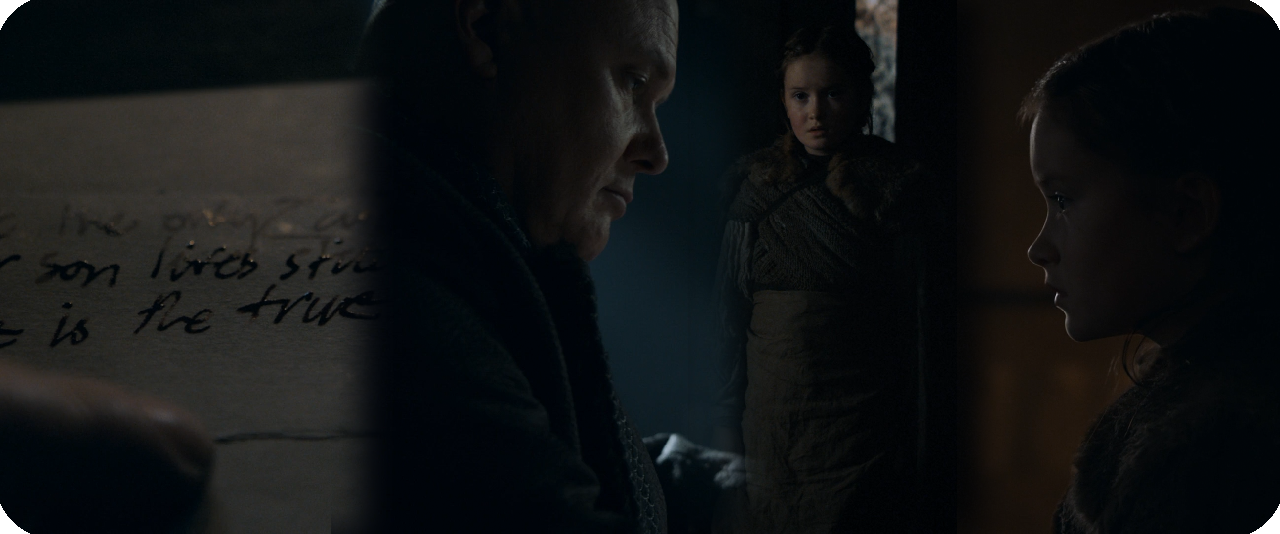
Before we start, here’s a barebones scene description that purposefully ignores character names and narrative context:
A man writes on paper. A young girl tells him a certain woman won't eat, and that the woman's soldiers are watching her. He takes her hand, reassures her that great risks provide great rewards, and tells her to go.
Here we go!
Shot 1
I enjoy it when scenes start with macro shots (extreme closeups of non-humans) that provide some flavour or information that then ripple across the rest of the scene. This is a good example: emphasizing "he is the true heir to the iron throne" here has obvious dramatic potential that gives a charge to what is otherwise a fairly dramatically inert scene. I also like the angle here, both providing a legible view and emphasizing the paper as a tactile object, part of a space. The lighting further helps to characterize the space (though in context the yellowish tinge of light makes little sense since it’s supposed to be daylight, which is strictly represented in blueish tones).
Shot 2
Next, a backwards dolly moves from a closeup of the writer to a wide, and a dark figure steps into foreground. As a camera movement, I think this is well-motivated: it identifies the writer in a view similar to the macro shot of the paper, and then pulls back from that close-up aesthetic to the full scope of the scene. After the initial reveal of the space, the continued motion is justified by a knock on the door, which creates a further sense of potential (perhaps a threat?), so the backwards motion (and indistinctness of the body in foreground) enlivens our curiosity about who's there. The framing of the shot is fairly middling, though that's not necessarily a problem given the lighting scheme (more on that in a moment). Still, it's a fairly unimaginative use of all the negative space offered by the shadows.
One point about the framing worth praise: At the start of the shot, the writer's face is large enough in the frame that he's a clearly discernible figure, in spite of the very dark space. Pulling back makes him smaller, so the camera frames his head into a distinct silhouette over the window. Nice.
Next, let’s address the lighting. GoT has a general attitude of treating medieval-style spaces built of rock and lit entirely by small windows as, y'know, pretty fucking dark. I really respect this more-or-less series-wide choice. It's taken to quite an extreme here, and I like that; there's so much in darkness in this scene that it really bolsters the sense that this guy is tucked into a secret little nook, writing and hearing about things he probably shouldn't. So props for the overall conceit.
However, there are some points of inconsistency that make the lighting feel unnatural across the scene. It’s worth remarking upon, so it’s worth quickly skipping ahead to get a sense of the overall lighting scheme. shot 8 (seen here) reveals that the whole scene is lit by 3 windows and a candle. Two of the windows are on one side of the room, spaced quite far apart, and one is right next to the desk. Hard rays of light are shooting directly through the one near the desk but not the others; the implication is that light streaming through the desk window are direct sunlight. As a result, the direct light hitting the desk has more intense highlights and shadows than the ambient light coming from the right, which just softly lights the side of the writer's face. So far, works fine. Let's move on.
Shot 3
Now we get the payoff to all that buildup of expectations via the knocking and the sweeping backwards dolly: it's just a kid! I like this reversal of expectations and how the visuals of the first shot set it up, but let's talk about this shot. There are only three points of interest in the frame: the girl, that little rectangle of light behind her implying a slightly open door, and those tiny little blue highlights — looks like it's a vase reflecting a bit of the room's sunlight. Otherwise, it’s copious negative space. Now, if we know the whole scene, we can infer that she's being lit by the farther of the two windows on the right, but remember that hasn't been established yet. That feeling of "where's the light source", the overwhelming blackness, the flat angle, and the fact that her body was too close to the camera in the last shot to judge relative distance all contribute to a pronounced spatial confusion. The shot feels totally disconnected from the space of shot 2. It feels abstracted, and not in a deliberate way, but in a way that directly clashes from that big dolly shot's careful delineation of the visible room. That sense of intrinsically understanding the space has been instantly broken by this reverse shot.
But there’s more cause to pile on shot 3. I am not a fan of its composition at all. It does nothing with the negative space, and the girl is too subtly lit for her to stand out as some bright counterpoint. Her and that rectangle are basically just a smudgy vertical stripe. Yuck.
Shot 4
Now we come to a reverse of the writer. This is just an angle from partway through the earlier dolly move, and the composition is again just okay, though I'll spare a positive note for the use of those rays to intensify both his rightward-look at the girl and his interest in his papers. He cuts something of an imposing, intimidating figure in this shot that plays well into the girl’s nervousness and really boosts the dynamic of the scene.
Shot 5
The next shot changes up the shot-reverse formula by placing both characters in the frame. Truthfully, I cannot understand why this wasn't used to introduce the girl. Her small size in the frame relative to him would have emphasized the punchline of her being a lesser threat than we feared, and her position in the space is much, much clearer. If you absolutely had to retain both shots, I would place Shot 3 here instead, as the closer view of her face emphasizes her nervousness about the soldiers watching her, which is the main dramatic beat of this shot. The writer's replies could be played in standard reverse setups. It would work better, I think.
But that’s enough about how I think the scene could or should be, back to how it is. This shot's composition is again just okay. I do like the reverse-L shape creating a frame-within-a-frame, but again wish there was a little more done with the negative space in that within-frame. (A splash of light from a candle would have done wonders here.) Dramatically, it actually does an alright job of expressing the writer's disinterest in the girl's fears: he is either looking down at the paper, or, when he looks at her, his expression is hidden to us, lending an impersonal effect. Still there are ways to do this while also allowing the visuals to better express her fear.
Here's where my misgivings about the lighting come into focus: the light hitting the desk and writer does not look like natural sunlight in this shot. The highlights and hard shadow lines are gone. This was probably done to accommodate the shot, as having blinding highlights and crisply drawn shadows in the foreground would draw attention away from the girl, but this is a case where the shot should have either been rethought or scrapped entirely, because now the light feels completely artificial. Rather than direct sunlight, it looks like either light from a cloudy day, or ambient, indirect light like what the other windows do in other shots. It's soft, it rolls off gradually, it doesn't create bright highlights. It messes with our internal sense of how light works badly.
This shot (and the scene in general so far) really feels like a hodgepodge, like some creative decisions were made, and then a bunch of "practical" choices went on top and at some point the intent and style was left behind. Not without its merits, but not good either. It's these sorts of heavy compromises towards traditions of quality that keeps Game of Thrones's lighting aesthetic from feeling interesting or real. It's why every time I look at an interior scene from the show, I come away thinking "That feels like a studio."
Shot 6
Then we get this! After a series of mostly compositionally uninteresting shots with decreasing dramatic propulsion, we get a very nice reversal from the writer's insouciant demeanour for this simply expressed gesture of kindness. I wouldn't call it a masterpiece, but I don't have anything bad to say about this shot: they committed to the lighting in smart ways, created a nice lighting gradient on the desk that silhouettes the hand well, and I like the subtle rim light over the top of the hand. It also contrasts to the prior shots, all fairly traditionally placed mediums and wides, and returns us to Shot 1's display of the dramatic potential of a hand. It doesn't redeem the scene (the whole has already stacked too many problems), but I like it a lot.
Shot 7
Next, we get the first properly expressive shot of the girl. Conceptually, it works as a great counterpoint: mirroring the hand, emphasizing both the distance between them and the potential for a human connection. Eye lights, subtle soft shadow lighting, and a very nice profile rim create a really nice, dimly lit portrait of her face, and the orange, flickering candlelight in the background complements the blue tones prevalent elsewhere in the scene and helps her face stand out instead of negative space.
WHERE WAS THIS CANDLELIGHT IN THE EARLIER SHOTS OF HER? On a purely logical level you could argue that it's close to the wall and therefore would only light the wall, but this could and should have been "cheated" to light the wall closer to her without anyone questioning it. That, or just add another candle! It's possible (even probable) that this was the sort of technical oversight common to the fast pace and budget limitations of television, but hey — that just speaks to not working well with your medium's limitations.
But I don't want to end my notes on this shot on a negative. It doesn't have the same punch and "wow" factor as shot 6, but it builds off it smartly, and I like it just as much.
Shot 8
Shot 8 is the widest shot of the scene and reveals all of the light sources. This is probably the compositionally strongest non-closeup in the scene, with the light rays explicitly casting the writer as a saint-like figure, and the dark space between him and the girl well used, since she crosses it over the course of the shot — "Crossing the darkness to forge a human connection," something like that. Unfortunately, it also reverses some of the scene's more interesting visual choices.
First, there is virtually no *true* negative space in the room, since very little of it is black, except for the shadow under the desk. Almost everything else has gradations of light and perceptible detail or geometric activity going on. The justification may be "It would look weird to have a wide where we can't see any of the room", but I say, that's what would make it interesting. Run with it! Have the characters in a pool of light in the middle of a sea of blackness! This speaks to those traditions of quality (i.e. "Production Value") in TV that Game of Thrones adheres to in its lighting and, again, makes its spaces feel a lot less visually interesting and convincing than they should. It's both inconsistent and a missed creative opportunity.
Second, it suddenly reveals the room to be much larger than it seemed before. Earlier, there was no hint that the space was this big; it would be natural to infer the wall would be halfway between this camera position and the characters. You can kind of justify this by saying: the connection they form opens up emotional space, that making the room "bigger" connotes hope, etc. I think communicating these ideas between two individuals in a secretive room is much more interesting... and more consistent.
Don’t get me wrong, in a vacuum, it’s a fine shot, though unimpressive in its use of light. It’s the inconsistencies and lack of stylistic commitment that make it a bit of a liability to the scene overall.
Shot 9
A closeup of the girl. Her relative size, the angle, and the fact that the camera is panning as she walks into her place makes me believe this is the same shot setup as Shot 7, and the candlelight was *just* out of frame before the pan. Real shame. I can’t think of a good reason not to have a second candle in the room to fix this.
It's not a particularly interesting shot, but it works fine, meat-and-potatoes shot-reverse stuff here. Kind of an uninteresting way to end an interaction that had such visual fireworks a few seconds ago, though.
Shot 10
Again, probably just a slightly adjusted position from the dolly track. Not much new to say, except that having each character visible in the foreground of the other's reverse shot is kind of a nice way to suggest their newfound emotional proximity. It still feels anti-climactic.
Shot 11
Now we move into the final two shots of the scene, which form a visual denouement. In shot 10 we pan back out of the candlelight as the girl walks away. It's not an interesting shot, but here her moving into blackness at least *kinda* makes sense as she moves out of that emotional warmth, and the panning movement makes it feel much more dynamic than shot 3.
Shot 12
Finally, the dolly moves in closer to the writer, mirroring the girl moving away from the camera in shot 11. Dollying in on a thinking character is kind of a one-size-fits-all way to put a button on your scene, and it comes off as especially uninteresting when the character’s face is so still and inscrutable, but nonetheless it works just fine; I have neither a positive nor negative reaction to it.
Summing Up
While the scene has some points of aesthetic interest and a genuinely impressive moment spanning two very well-thought-out shots, its ideas otherwise never connect into a cohesive whole, either on the level of individual shots or the entire scene. While the limitations of TV often dictate limited setups and camera placements that are then reused across the scene, this means that A: If you want a visually sumptuous TV show, you have to work well with those limitations and find ways to make them sing (see: Rainer Werner Fassbinder’s Berlin Alexanderplatz), or B: You de-emphasize or scale back on the number of aesthetic elements you're playing with and maximize your use of a more limited technical palette. The vast majority of the time, TV is better served by B.
In short, the scene is visually not really remarkable, and yet it's still one of the highlights of the episode's cinematography. Time and time again, even in the most favourable sequences, I can never find means to justify the widespread hyperbole about the cinematography in Game of Thrones.
Notes on John Wick (2014)
I can no longer ignore these. Wick, like a lot of action movies that boast technically astonishing fight choreography, is directed by two veterans of stuntwork, Chad Stahelski and David Leitch; the question with auteurs who come into the genre from this direction is whether they are only interested in feature length technical expressions of the craft they practiced outside the director's chair, or whether they're interested in dramatic modulation emotionally resonant aesthetic choices, technique that expresses more than technical strength.
By Willa Ross
For years, I've avoided this, its first sequel, and Atomic Blonde, in large part because the kind of acclaim they received tended to overlap heavily with The Raid 2: Berendal, a film I do not care for. The Raid 2, for my money, is a film interested in intricately choreographed action without character (let alone characters), which frequently takes as its emphasis the physical brutalization and mutilation of the body, with an expectation that this will be played sheerly for laughs. It's a film that crosses the line between a cathartic, escapist enjoyment of carefully staged violence anchored in an emotional context, and a giddy display of pain and technical virtuosity without attempting a structure or sense of progression in each action scene. Descriptions of the John Wicks tended to both explicitly cite The Raid 2 as similar, and describe John Wick in nearly identical terms.
Regardless, like the Raid movies, John Wick and its Chapter 2 sequel have been common in discussions of contemporary action cinema and its exemplars, and as someone who cares very much about the genre and would like to see its potential ways forward outside the Marvel Cinematic Universe, I can no longer ignore these. Wick, like a lot of action movies that boast technically astonishing fight choreography, is directed by two veterans of stuntwork, Chad Stahelski and David Leitch; the question with auteurs who come into the genre from this direction is whether they are only interested in feature length technical expressions of the craft they practiced outside the director's chair, or whether they're interested in dramatic modulation emotionally resonant aesthetic choices, technique that expresses more than technical strength.
The answer is that they do care — in fact, sometimes they seems to care more than their writer Derek Kolstad — though as of this first entry they’re inexperienced hands at showing it. John Wick's action deserves the praise it gets as a technical showcase for Stahelski and Leitch, their stunt team, and Keanu Reeves; it is also, thankfully, an action movie with an interest in how its characters think — not to mention it knows how to tell a fucking joke. The brutality on display here is undeniable, but the film takes its time over around 30 minutes to establish it as an almost abstract metaphor for the title character's rage: rage that, with all the senseless loss and grief that one can endure by chance in life, human beings can also enact cruelty by choice. In John Wick, the thematic locus of that cruelty remains frustratingly abstract; crime-revenge cliche explanations for the senseless pain that Wick endures are trotted out — "the past", "bad luck", "people don't change" — but don't actually find much in the narrative to support them, and tend to come off as a self-serious hodgepodge attempt to simulate emotional grandeur without doing the work for it. Nonetheless, they kill the guy's adorable fucking puppy. There's a dramatic core there to work with. I mean, I don't know about you, but I love puppies.
If Wick embraced that kinda goofy degree of emotional simplicity more, it'd probably do it a lot more good than the way it strains to show import. While I genuinely appreciate the time the film takes to establish Wick as a man suffering terrible grief in the opening sequences, both the writing and direction of these scenes are full of cliches and feel more perfunctory than they clearly intend to, with hardly any inspired moments that establish a genuine connection. (An exception: the puppy wakes up Wick just seconds before his alarm clock buzzes. Awww. I love puppies.)
Regardless, the shot direction, sound, and music of the pre-puppy-killing scenes are thoroughly unimpressive: boilerplate drama without much more to than kinda hackneyed screenplay gestures and a blue filter to lend it emotional heft. One could levy complaints at Reeves’s customarily subdued performance for not expressing more, but it’s entirely in keeping with his character. Most frustrating in these scenes is the wandering, isolated piano chords, so familiar to this kind of material that it actively saps personality out of the film when it plays (the score turns out to be by far the film’s biggest liability). One moment in particular does far more to legitimize the sorrow being pushed forward by these scenes than any other: Willem Dafoe, whose sunken features can without effort express as much long-suffered pain as any actor trying their absolute hardest, offers Wick’s single best line delivery when he tells John, with a mixture of boredom, pity, and personal melancholy, “There’s no rhyme or reason to this life. It’s days like today scattered among the rest.” Dafoe does solid work throughout, but this is plainly the moment he was cast for, and it’s the highlight of the film’s vulnerable side.
Eventually, though, the bad mobsters kill the puppy and beat up John and steal his car, and the fighting begins. I won’t go so far as to say that the plot is unimportant going forward — it’s pretty stock, but it’s a plot, and it is used to propel the action material and maintain a sense of stakes — but there’s not much reason to detail it or its effects any further than I did between those em dashes just now. This isn’t entirely a complaint, as just because something is “simple” doesn’t mean it can’t be interesting or serve the work as a whole. Still, there’s a thin line between simplicity and dullness that the film’s plotty sections sometimes fall on the wrong side of; specifically, I wish there was more playfulness in how these mobster characters are written (beyond a funny running gag that, contra standard depictions of overconfident, egomaniacal organized criminals, everyone seems kind of resigned to the fact that Wick is bound to slaughter them effortlessly).
One of the film’s chief pleasures is that slaughtering dozens of people does look hard. Partly thanks to the fact that Reeves accomplishes the vast majority of his own stunts, a sense of constant, extreme bodily exertion comes through in every gunfight. It’s not just good because it looks hard, either; I would argue that the greatest (and most commonly neglected) asset of watching an action scene is showing how combatants adopt tactics and then shift them over the course of battle, and while John Wick does occasionally fall into rote cover-and-suppress-and-shoot staging with little to distinguish the behaviour at the end of the fight from the start, it otherwise succeeds through a pliable formula: John Wick and a few dozen baddies are in a room; the baddies set the pace and direction of battle; John adapts. How John adapts presents dozens of little surprises, as if every few seconds he solves a complex puzzle using only his body and his gun.
The action moves so fast that we really do need to give Stahelski and Leitch props for just how well they understands action staging; it’s very rare that the camera’s movement and the cutting create spatial confusion, the most important objects and events are most always emphasized by the framing, and the graphic orientations and motions within the frame create clean, easily followed cuts. The only serious liability on following the action is the film’s bizarre commitment to low-contrast, low-highlight cinematography, perhaps selected because of its associations with a grittier tone and “artier” visuals; this compressed dynamic range inevitably reduces the audience’s ability to distinguish details which, in fast-paced, complicated action sequences, can make it harder than it should be to figure out who is doing what.
The overall camera positioning conceits are solid enough that I can’t help but lay some blame for this with Jonathan Sela, a cinematographer whose work I’ve yet to find cause to enjoy. Besides the contrast, Sela also has serious issues with composing interesting, well-balanced frames. The scope ratio of 2.35:1 that’s become standard issue in mass-commercialized and genre pictures is almost certainly the hardest standard frame to compose for, so heavily horizontal as it is, and Sela hardly ever martials the geometry of his shots into something memorable or expressive — and when he does, the contrast scuttles it. John Wick also opts for a look that usually favours strong, non-natural colour washes, and that can be an interesting approach with a lot of creative potential. Limiting the colour range gives the eye less means to delineate the subjects of an image, which can be compensated for by — you guessed it — a higher contrast, or careful framing. It’s all a good example of decisions that can be intellectualized in a vacuum, but wind up doing damage to each other in practice, and aren’t especially well-executed taken on their own anyway.
Unfortunately we can’t leave the film alone with that sweeping dismissal. If you’re one for reading parentheticals (and fuck everyone who’s not, am I right folks?), you probably noticed that I said the score was John Wick’s biggest liability. And it is. The music for this movie is downright awful, and once the movie exits its low gear of ominous, metallic drones and boring piano chords, it moves into the equally thoughtless but far more irritating mode of boring rock pieces, anchored by thuddingly static drum lines and generic guitar chords. Even pre-existing music like Marilyn Manson’s “Killing Strangers” fails to stand out whatsoever from the musical tapestry on display outside of the vocals. For all the failings of the photography, you can at least detect that someone wanted to think of ways to make this look different from other movies. It doesn’t come across like any effort was made to craft a distinct soundtrack here. Frankly, it sounds like something pulled from a sound library and slapped on the soundtrack with only cursory attention to the film’s emotional ebbs and flow.
Underlying all these issues is a sense that, in spite of honest efforts by Stahelski and Leitch to develop their movie’s personality beyond that of a stunt/fight choreography extravaganza, John Wick doesn’t have a clear personality that you could describe without contradicting yourself. Yet I still liked it, not only for the effort on display, but for the numerous moments when it succeeds so well, most often in moments when John dives, rolls, whips around, or tackles his way through foes who almost never seem like they’re designed to be just stupid enough kill. But it also doesn’t look anything like a revelatory piece of contemporary action cinema to me. The landscape before and after this came out in 2014 doesn’t seem that different. It’s hard to say this is more than one more shoot-em-up, scattered among the rest.
Other Essays in This Series
John Wick
John Wick: Chapter 2
John Wick: Chapter 3 – Parabellum
FILM FORMALLY
Film Formally gets granular about how movies work by choosing a technique or trait and studying it through its best examples. Every Tuesday, Independent filmmakers Devan Scott and Willa Ross leverage years of watching and making movies to bring you spirited and approachable conversations, offering brick-by-brick analysis and discussions about how movies work.
Associate Producer: Paige Smith
Current season edited by Amanda Avery
Got an idea? A guest you’d like to hear from? Give us a shout at filmformally@gmail.com.